If your logo isn’t your brand, as my colleague Ryan pointed out in a previous post, then what is a logo, and what role does it play in your brand identity?
A logo is a picture or drawing meant to represent something or someone else—in this case, your brand. It can be extremely simple or complex, depending on what or whom you’re trying to represent.
A good logo is made up of several different carefully thought out and executed forms that embody your brand in one way or another. The goal of a logo and the brand as a whole is to be memorable. You want your customer to walk away with a feeling about your brand that was carefully crafted by you and to remember that feeling every time they think of or see your logo.
Types of Logos
Logos come in many different forms, styles, and specific categories. Understanding the different categories of logos and their elements can help you make important decisions when building and maintaining your brand, all while helping you target your customers more accurately.
In general, I like to lump logos in three basic compartments: wordmarks, brandmarks, and combination lockups. These three compartments can cross-pollinate, live separate from each other, or stand on their own, and are usually parts of a larger logo system. Typically, an entire logo system is built for the brand so that different elements can be applied to a more specific application, in which case it’s essential to develop a brand standards guide that dictates how to best use (and not use) the marks to maintain the integrity of your brand.
Wordmarks
Wordmarks are a type of logo that take on the name of the brand through typographic representation. It may sound simple, but the typographic choice and layout of the letterforms can have a tremendous impact on how your brand is perceived. A geometric sans serif typeface tightly kerned gives off a different feeling than the same type loosely aired out. A serif type choice can relay a sense of elegance, while custom-drawn type, as opposed to stock letterforms, can help youe brand stand out.
Over the years, we’ve created many different styles of wordmarks. Block Club’s wordmark is based on a stock typeface but has custom modifications. The wordmarks for Hotel Henry, Tommyrotter Distillery, and The Black Sheep feature totally custom lettering.
Lettermarks are similar to a wordmark in that typography is the basis of the logo. In this case, though, the text is typically an abbreviation or acronym to a much longer set of words or phrase (the NFL, NBA, and NHL come to mind as common examples). Lettermark are generally used by older, institutionalized brands. Their wide recognition is the reason they are able to shorten their name down to these abbreviated letterforms. Nobody says to tune into the American Broadcasting Company to watch Dancing with the Stars; they say tune into ABC.
Brandmarks
Brandmarks are probably what most people think of when they are asked to think of a brand’s logo. There’s a wide array of logos that would be considered a brandmark. If I asked you to describe the Nike logo, you wouldn’t think of the letterforms locked up with the “swoosh”; you’d think of the iconic swoosh itself, which is the brandmark.
Brandmarks, like those we created for clients The Grange Community Kitchen, Northland Workforce Training Center, Optimum Physician Alliance, and Broadleaf Results, left to right below, are pictorial in nature. Brandmarks are typically one part of a brand’s logo system and generally aren’t accompanied by any type, although the mark itself can be based on a character letter form. Usually, brandmarks are paired with a wordmark as part of a larger logo system. When they appear with a wordmark, they are referred to as combination logos.
Another common logo category is the mascot logo. A mascot logo is an anthropomorphized object used to target very specific audiences. Children and that critical 18 to 35 sports fan demo come to mind.
Animals, mythological creatures, and muppets fall into this category, but mascot logos are not just limited to children’s TV shows or your local football team. Mascot logos can also be found at your favorite breakfast spot, in your coffee, or at the BBQ pit. Brands we’ve helped shape like Swan Street Diner, Public Espresso + Coffee, and Fat Bob’s Smokehouse all use the mascot technique.

Abstract logos are exactly what they sound like. They are an exaggerated design form or picture that is relevant to the overall brand in some fashion. Many abstract logos are found paired with a wordmark, creating a combination logo. If an abstract logo has wide public recognition, it probably took a lot of time to get there. Abstract logos are typically part of a strategic design evolution in which, over time, the abstraction becomes more top of mind with consumers, and with each brand refresh it becomes more recognizable on its own. Jumping back to a brand like Nike, the abstract swoosh originally only appeared on the side of the product, the sneaker. On everything else, it was paired with logotype or a wordmark. Eventually, Nike had enough brand recognition that it was able to separate the swoosh from the wordmark and still be recognized as Nike.
The marks we created for Lume and Acara are examples of abstract logo forms.
Combination Marks
These logotypes are an extremely common type of logo. They are comprised of different logo elements we’ve already touched on to create a new logo form. Combination logos usually have a pictorial element to them, whether that is an abstract art form, custom letter, brandmark, or other graphic element paired with typography.
Logos like Northland Workforce Training Center’s primary logo combine the “N” factory brandmark and typography to form a stacked centered lockup. Other examples of this type of logo include Lume, IfThen, and Lexington Co-op Markets, below. Swan Street Diner’s logo melds these elements more closely together to form the combination lockup.
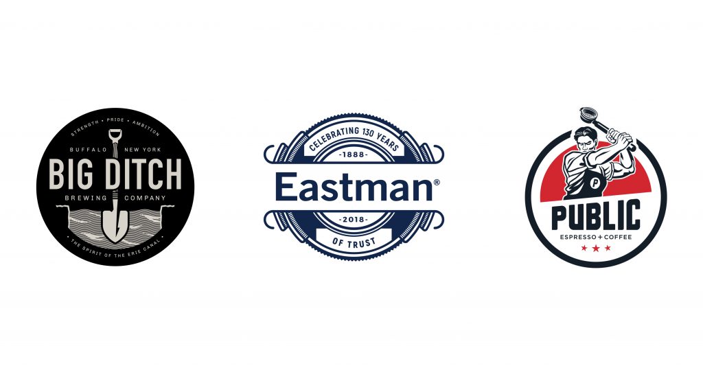
Another type of combination logo that would fall under this category would be an emblem. Emblems typically have a traditional feel to them. There is a heavy emphasis on typography sometimes paired with phrases, taglines, dates, or other important brand elements.
The backbone, though, of any emblem is the shape they are based on—usually a shield, circle, diamond, or rectangle. Emblems are a great choice for telling a longer story about your brand. Emblem-style logos, like the ones we created for Big Ditch Brewing Company, Eastman Machine‘s 130th anniversary and Public Espresso + Coffee quickly communicate a lot of brand information.
Remember, a logo is merely one part of the whole. It’s a picture meant to represent something, and understanding what that something is – what your brand actually stands for and the feelings you want your brand to evoke in your audience – is the most important part of the logo design process.
