A cloudless summer sky.
Deep Caribbean waters.
Smurfs.
These are just some of the pleasing images that come to mind when we think of saturated hues of blue. But which tints are preferred by the Block Club team? We reveal our favorite Pantone shades of blue. Which one’s your fave?

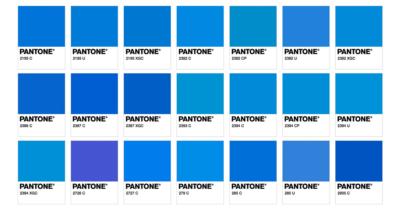
“Growing up there was this one house we use to drive by that was this bright shade of blue, similar to Pantone 2382 C. It was the only house on the street painted a bright color. The rest of the houses were plain white or colors that had no character to them. This blue house had nothing else special about it, just a particular bright shade of blue that made me happy.” – Tim, designer

“This isn’t my personal favorite slice of the spectrum here since these types of colors always feel like boring corporate America to me. However, I’ve recently been learning to love blues from studying classic French signage and packaging. That being said, my favorite is Pantone 7461-U because it is a bit more gray, more natural, reminds me of fancy china or a rich sky blue sky (credit to Jeff Tweedy).” – Ryan, designer

“I’m going towards the darker end of the spectrum and picking Pantone 2726 C. It reminds me of my favorite grape-scented Mr. Sketch marker I used in art class in elementary school. You know, before I moved on to the hard stuff like licorice and cinnamon.” – Pat, brand manager

“My pick is Pantone 2172 XGC, which mirrors this recent lovely 4-star rated day from the Awl’s “Weather Review” column. I started reading these bizarre, little slice of life / little-slice-of-apple-baked-into-the-hot-summer-sidewalk weather reviews a year ago and just can’t quit. ” – Margaret, brand strategist

“I like Pantone P 112-7 C. It reminds me of the water at this crazy beautiful shallow beach I love in Puerto Rico called Playa Sucia (“Dirty Beach,” yes). I’ve been daydreaming about it a lot lately during these stifling strings of 90+ degree days.” – Julie, designer

“I’m drawn to the Mediterranean tones of Pantone 2935-C. I visited Spain about 20 years ago and saw so many beautiful blues there, no doubt inspired by the sea. The famous Spanish tiles had this kind of dark, warm blue, too. Such a beautiful color.” – Ben, content strategist

“Pantone 2192 C for me. My grandparents had a set of children’s utensils in this color when I was younger. I really loved the color and design of them and have a ton of great memories sitting around the dinner table using them to eat my grandmother’s delicious food.” – Steve, brand manager

“I’m going with Pantone 2195U. As far as blues go, it’s the most amazing blue. We’ve had some of the worst blues this country has ever seen for eight years. When I am President, we’ll have the best blues, reds and greens, and only I can get them. Trust me.” – Dave, director of business development