Branding an expansive brewery in Western New York
Our Role
Brand Identity
Brand Messaging
Packaging
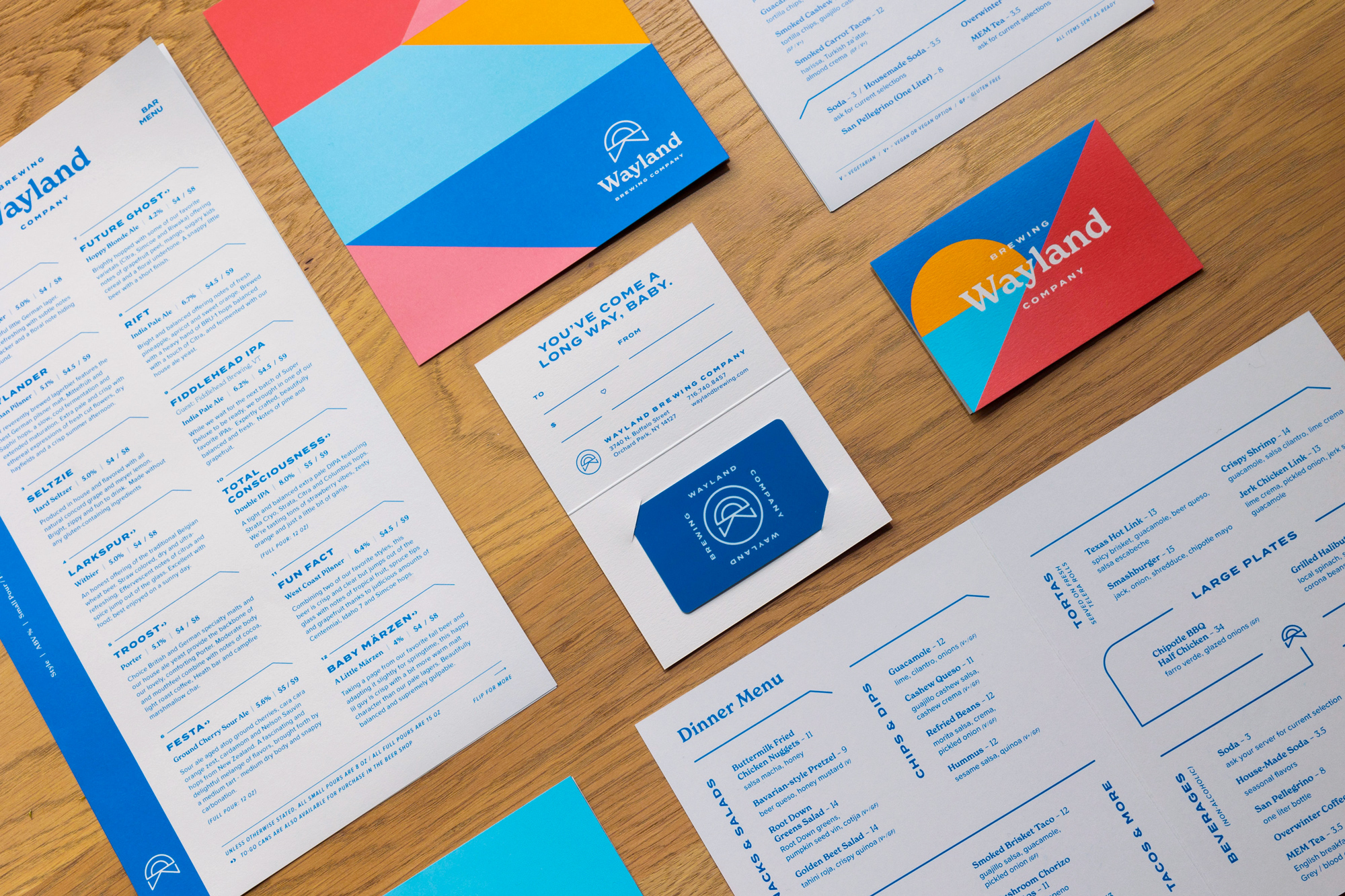
Print
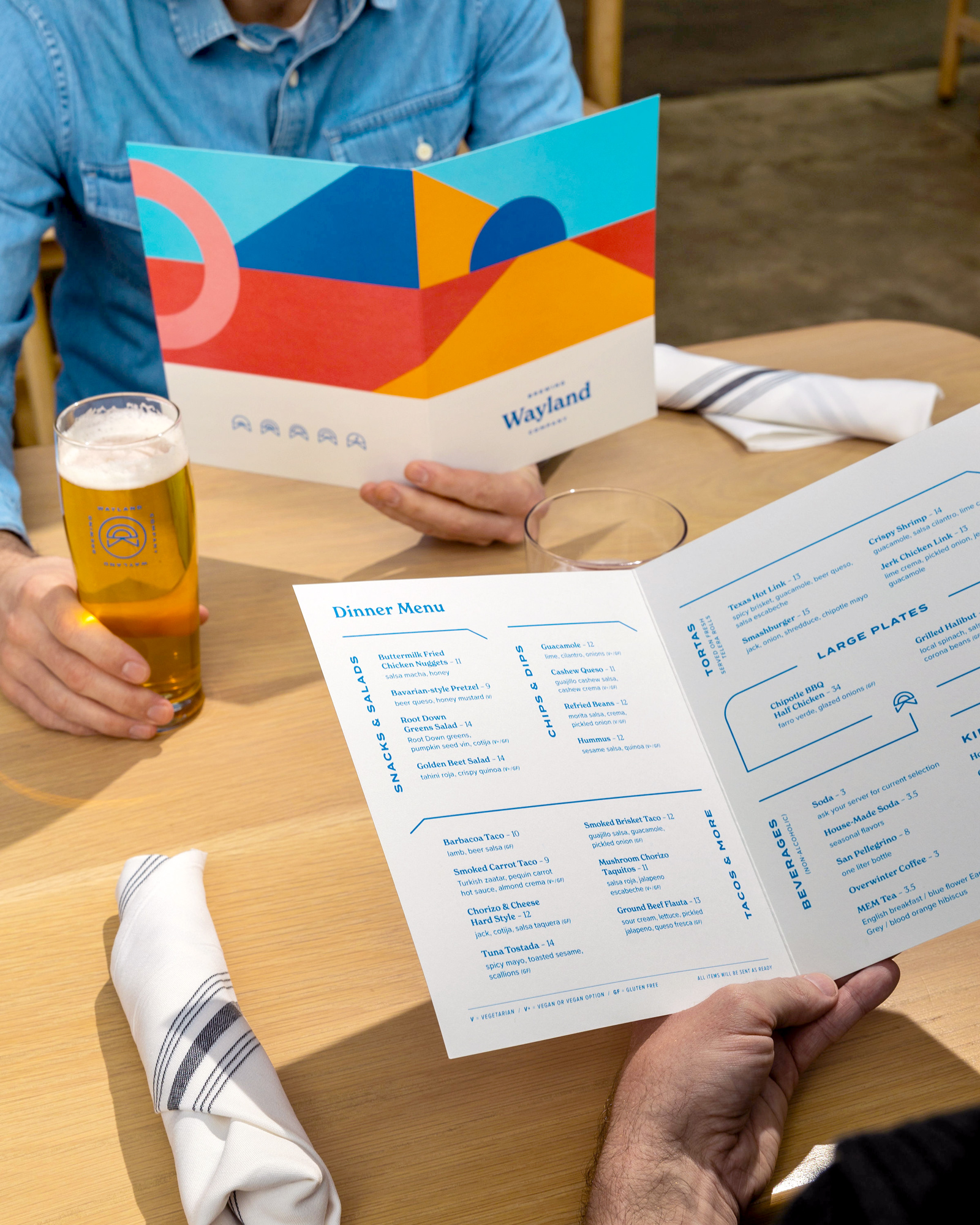
Collateral Copy & Design
Web Copy & Design
Signage & Wayfinding
Interior & Exterior Design
Caryn Dujanovich and Brad Rowell are prominent restaurateurs committed to creating community through food. When the two business owners set out to build a fourth restaurant to add to their empire—a brewery, taproom, and event space in Orchard Park, New York—they reengaged Block Club to develop a brand identity for their most ambitious project to date, from scratch.
Caryn Dujanovich and Brad Rowell are prominent restaurateurs committed to creating community through food. When the two business owners set out to build a fourth restaurant to add to their empire—a brewery, taproom, and event space in Orchard Park, New York—they reengaged Block Club to develop a brand identity for their most ambitious project to date, from scratch.
Challenge
Previously, Block Club worked with Dujanovich and Rowell to brand all the restaurants within their hospitality group: The Grange Community Kitchen, The Grange Outpost, and West Rose. The fourth installment in the same family of brands needed an identity that complemented the others while establishing an energy all its own.
The project would be Dujanovich and Rowell’s largest, most enterprising project to date alongside their co-owner and head brewer, PJ Dunn—an 18,000 square feet footprint that encompasses a taproom, curated beer garden, an event hall, and multiple rooms for smaller conferences, get-togethers, or customized celebrations. Since Block Club was branding the brewery from the ground up, it was also our biggest collaboration with the restaurateurs, and the project had more details, considerations, and moving parts than usual.
Block Club needed to draw on its long working history with Dujanovich and Rowell to create a dynamic brand, with numerous touchpoints and a diverse audience, that could stand out in a substantial physical space without getting lost.
Solution
During our discovery phase, we identified key themes to inform the brand we would ultimately create: nature, escape and relaxation, quality and craftsmanship, teamwork, nostalgia, and community. In sync with the tone and aesthetic of the brewery’s sister brands, we also set out to represent Dujanovich and Rowell’s commitment to excellence and attention to detail on yet another project.
Identity
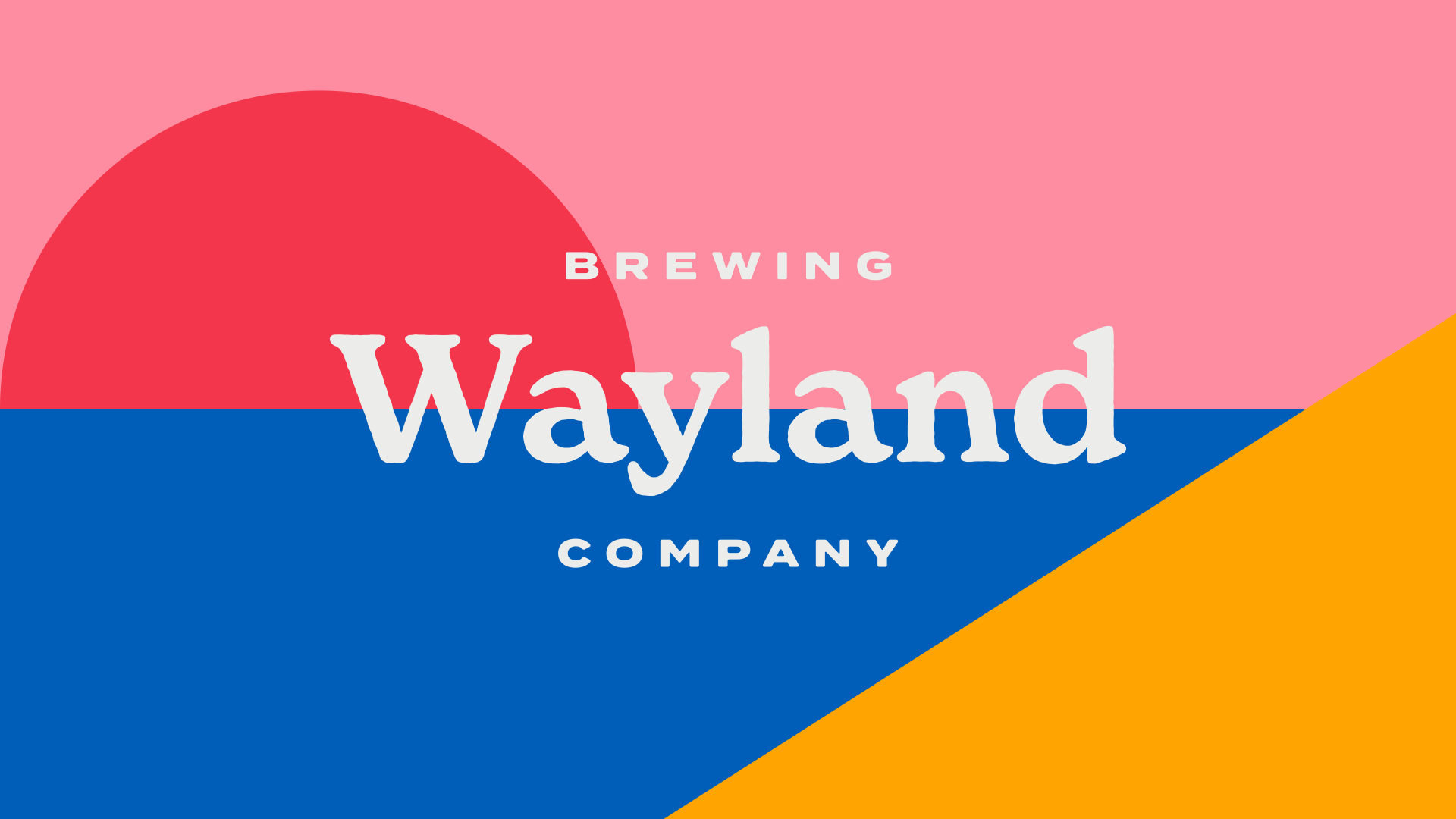
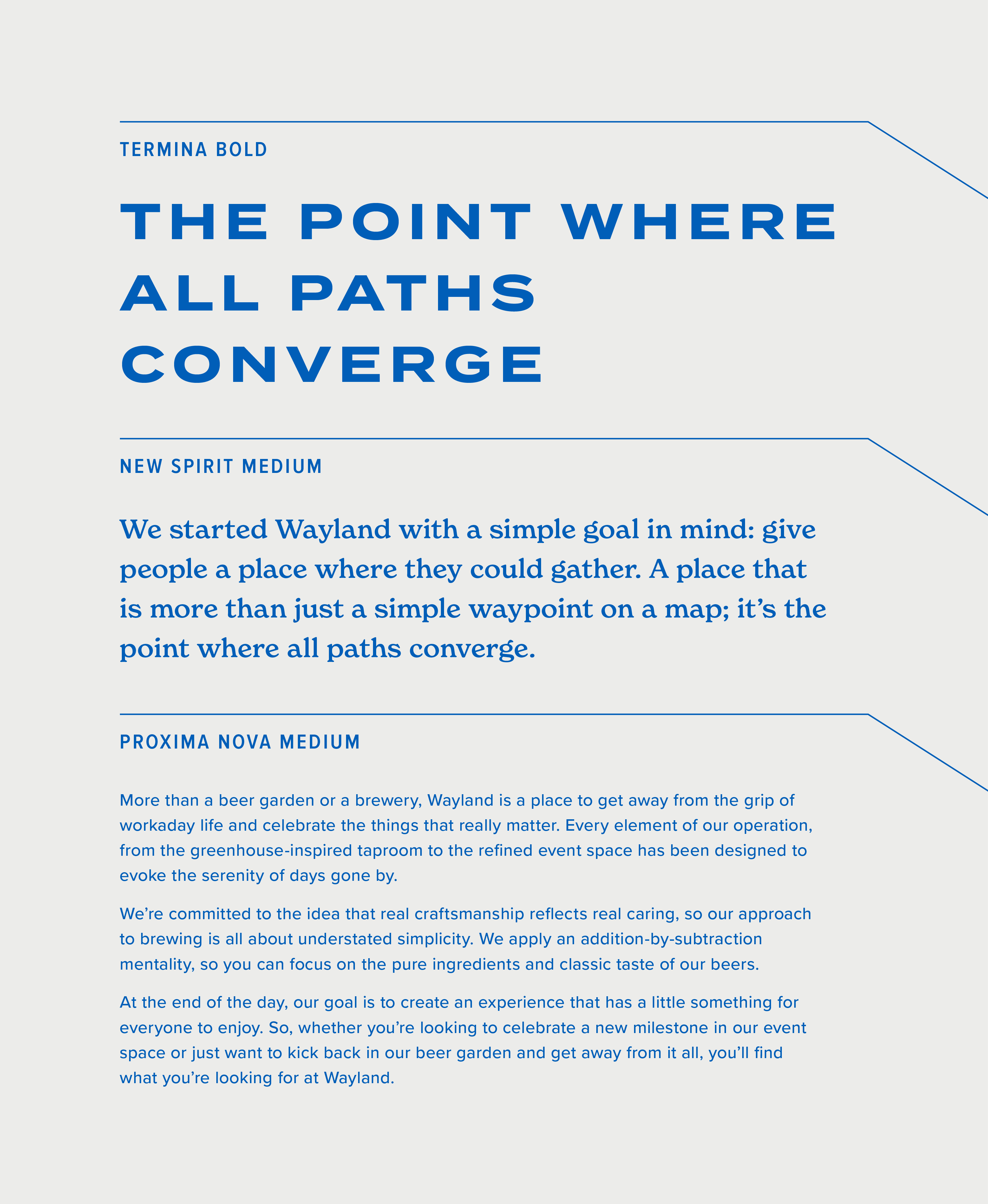
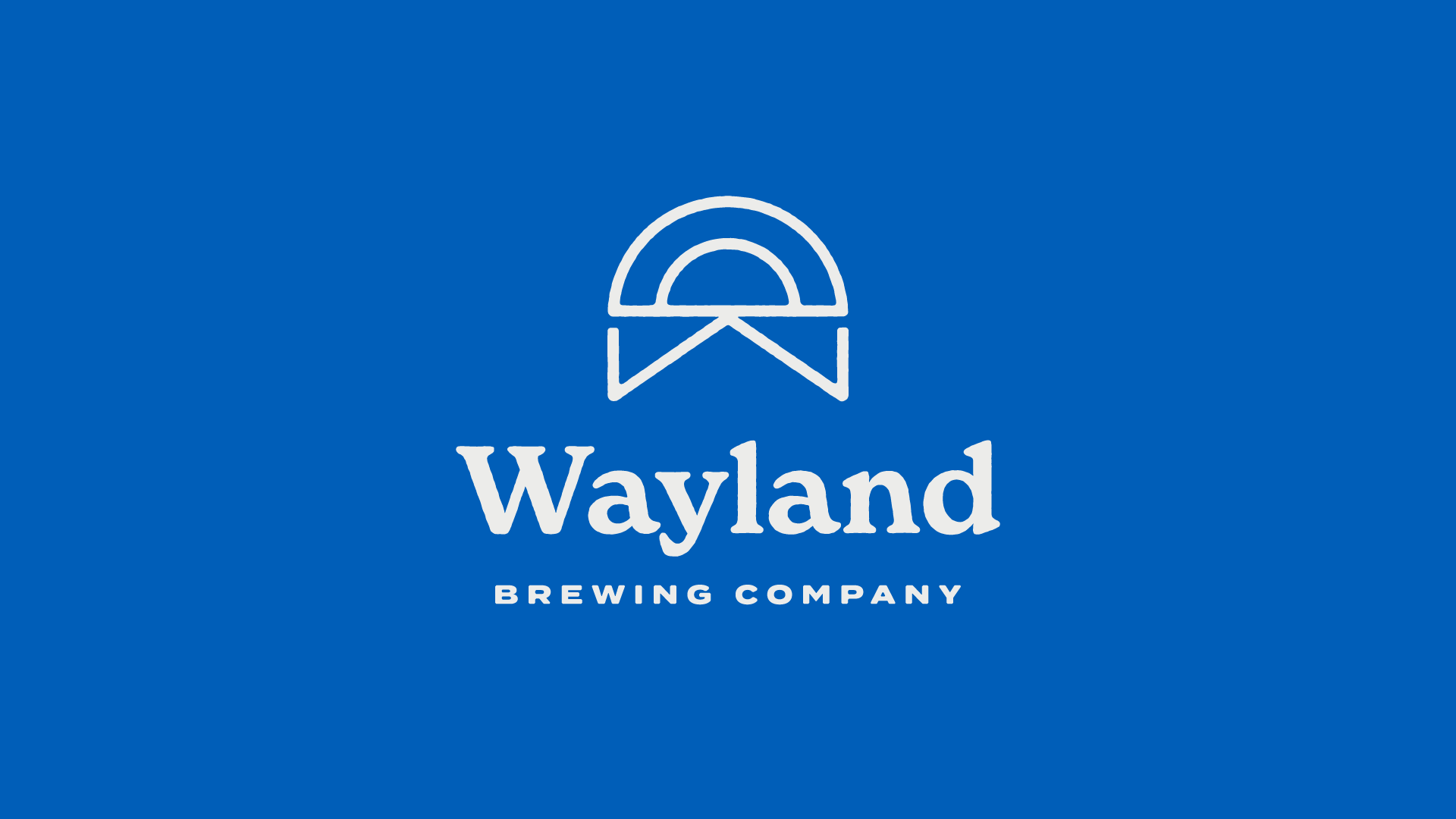
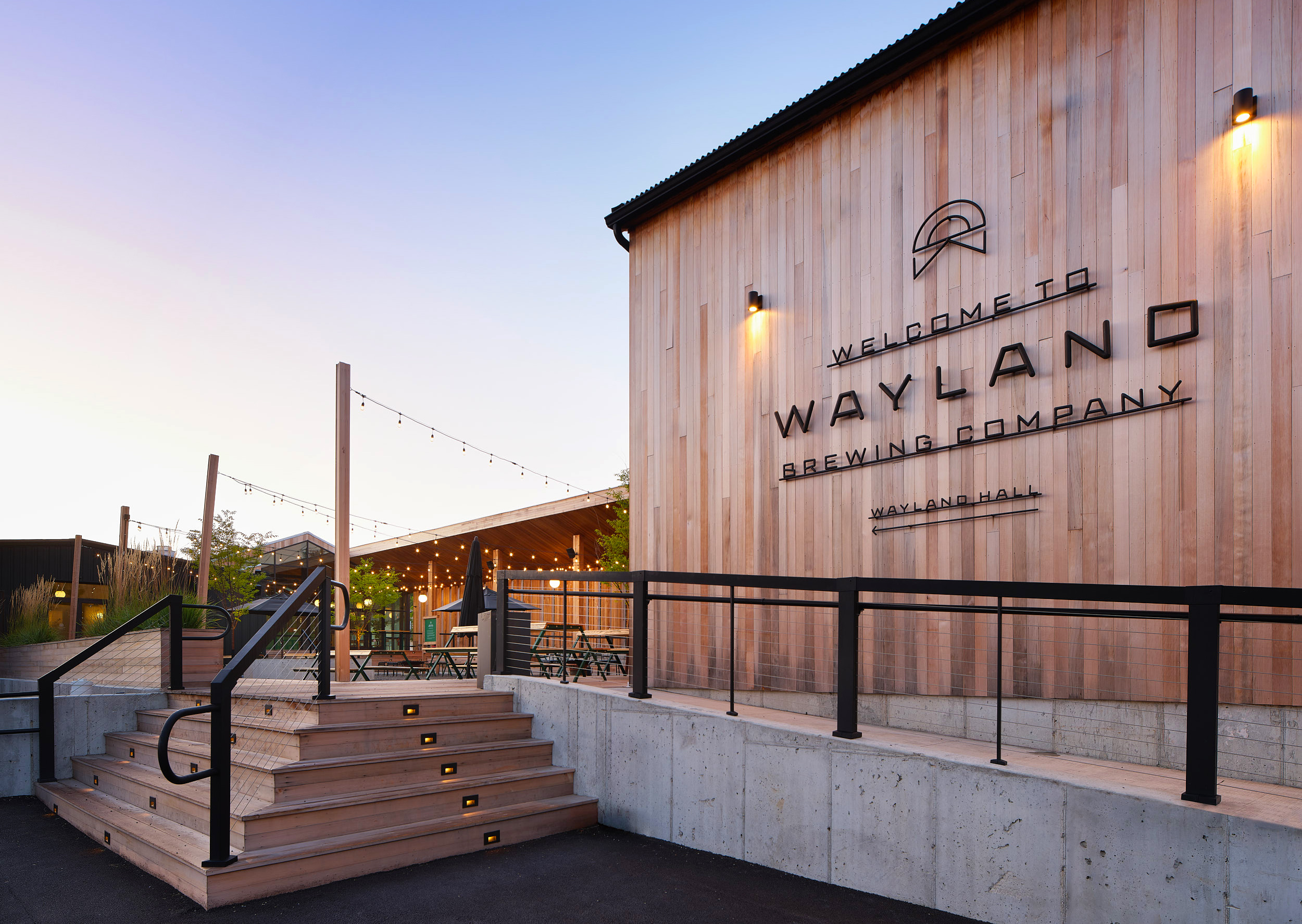
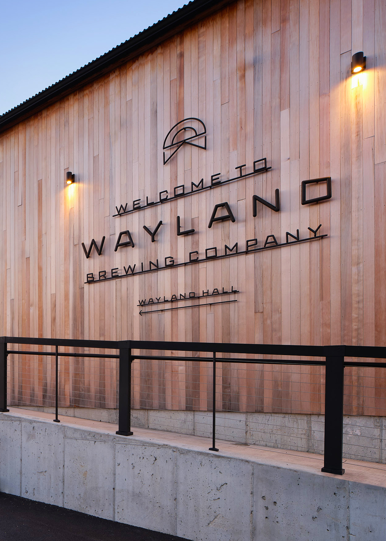
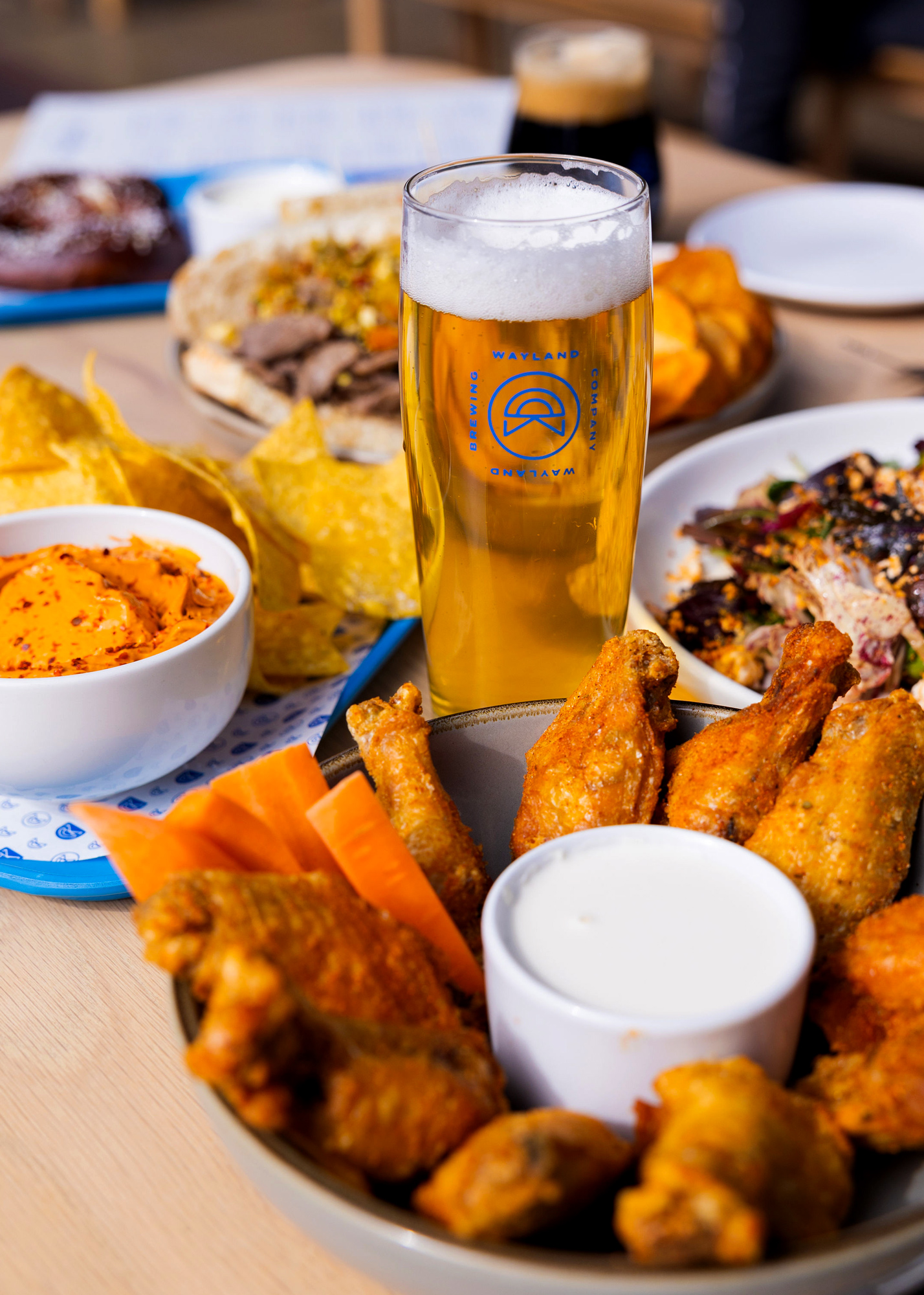
The name, Wayland Brewing Company, was selected for its poetic quality and the impression it left of abandoning the stressors of daily life. Once Wayland was selected, we designed a visual identity that is at once clean, modern, natural, warm, approachable, and light-hearted.
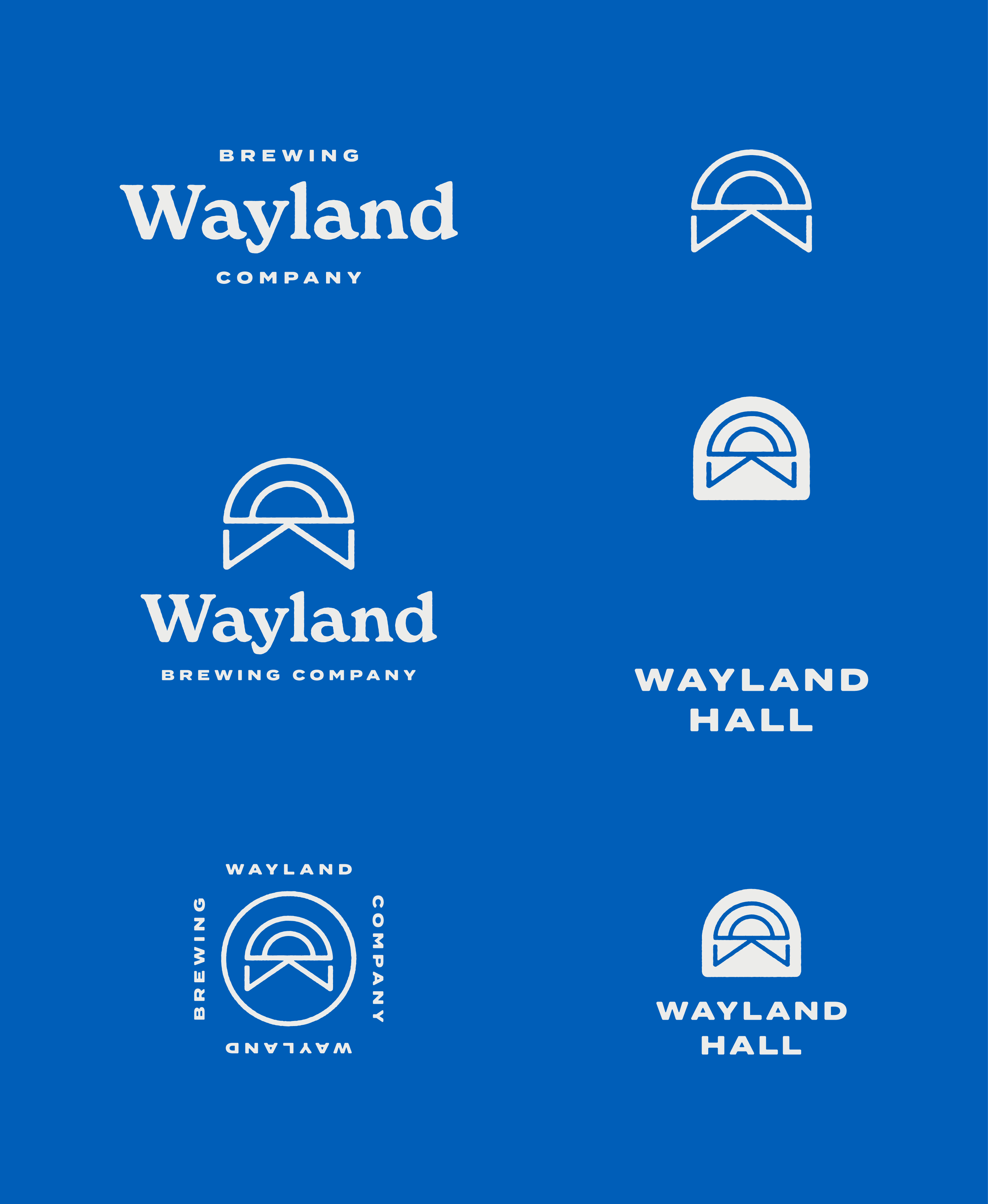
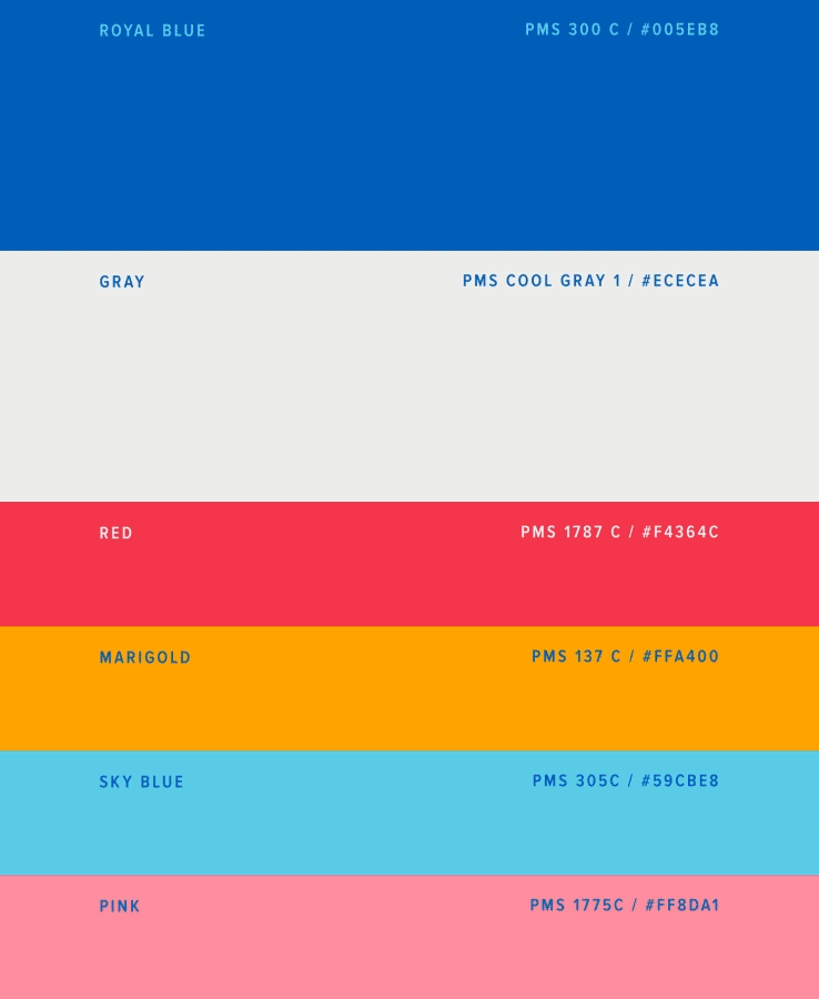
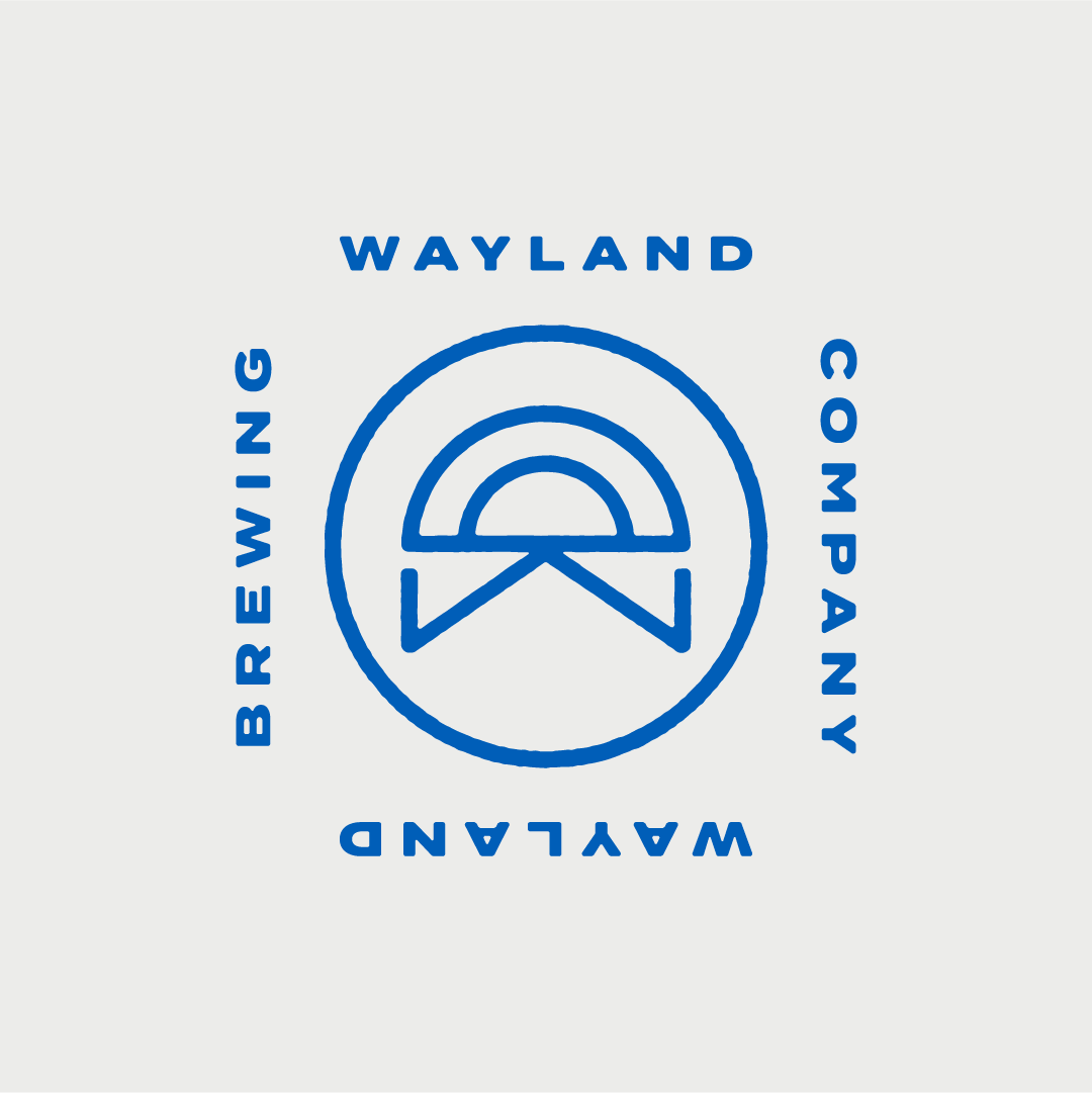
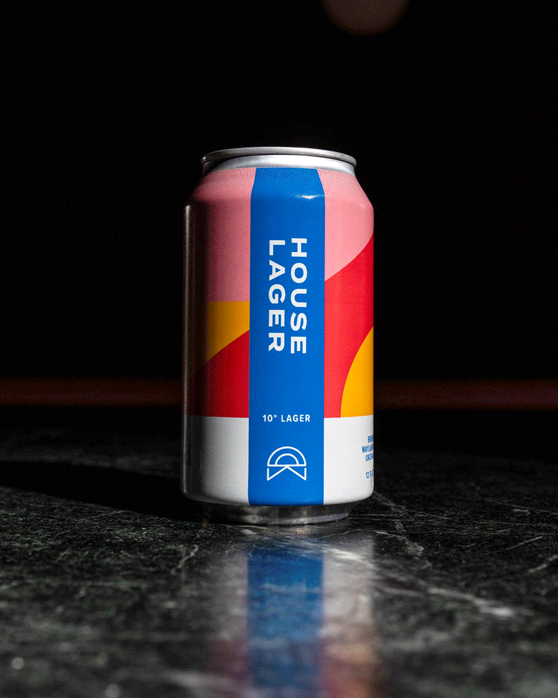
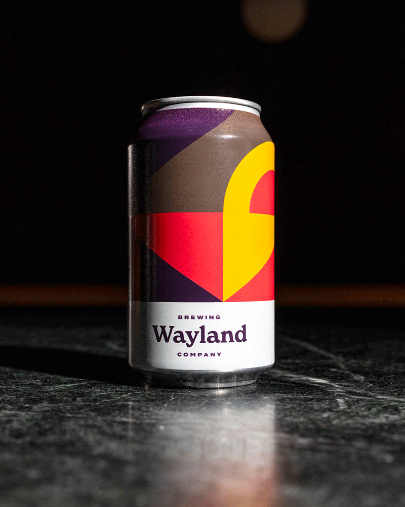
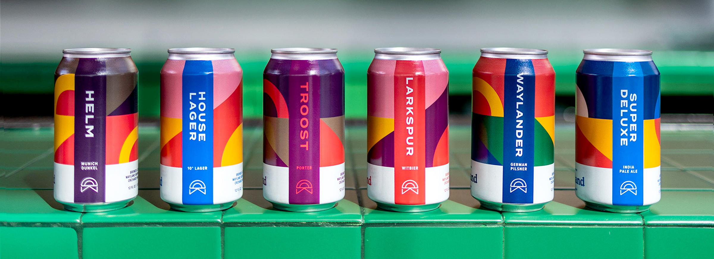
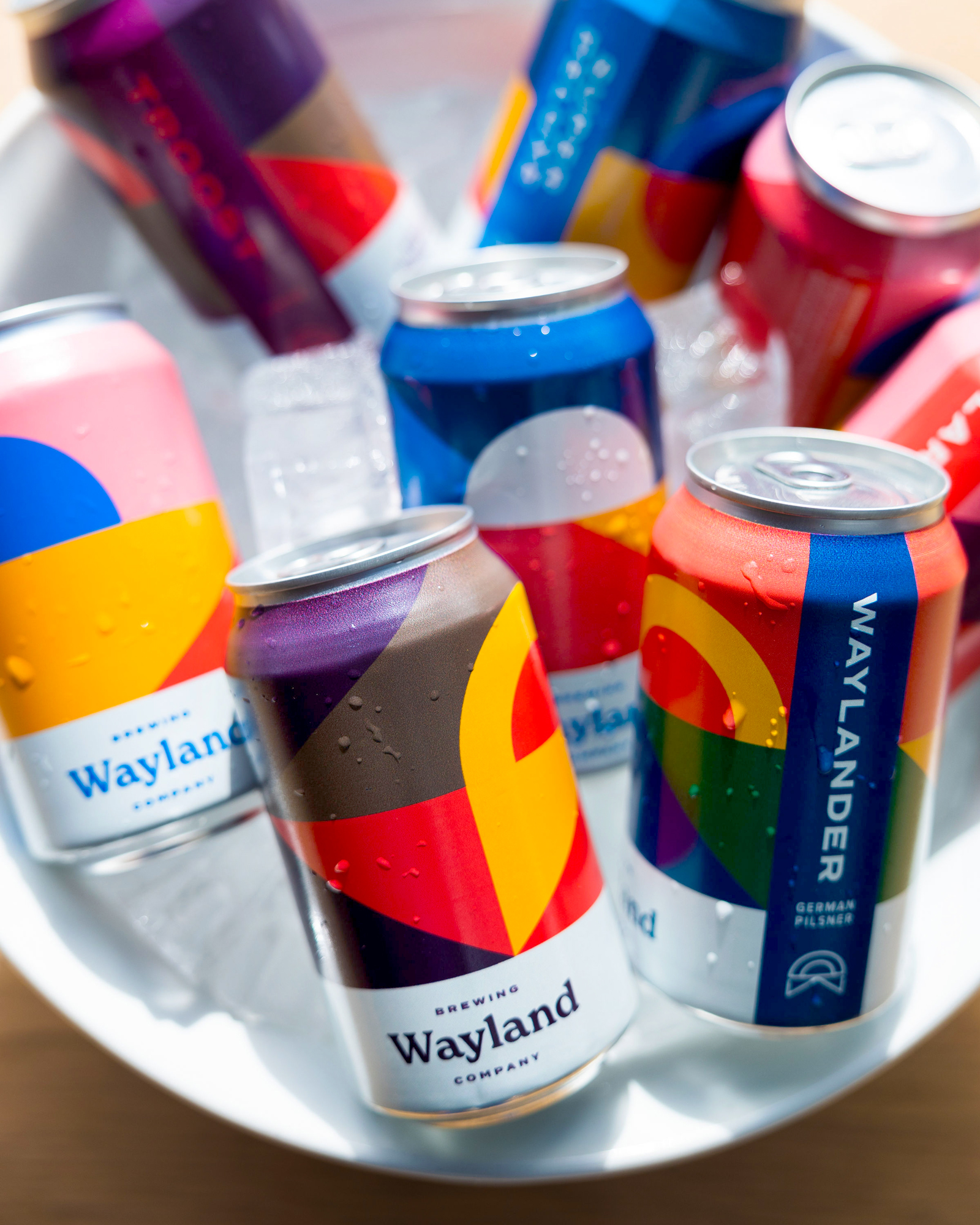
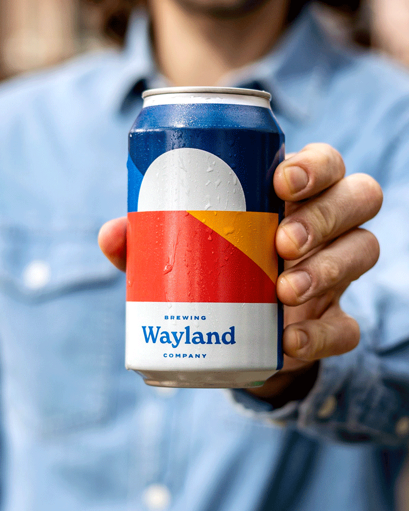
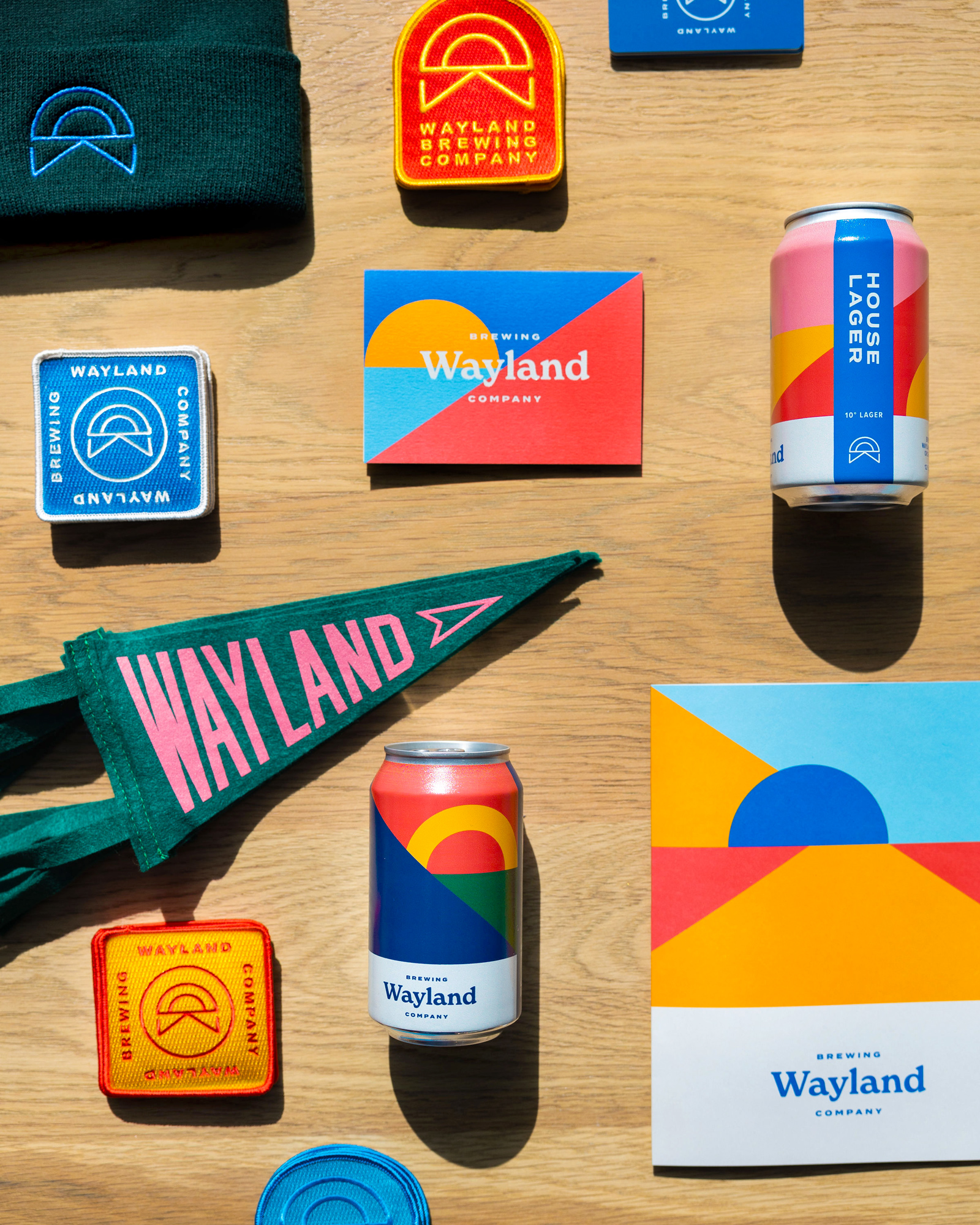
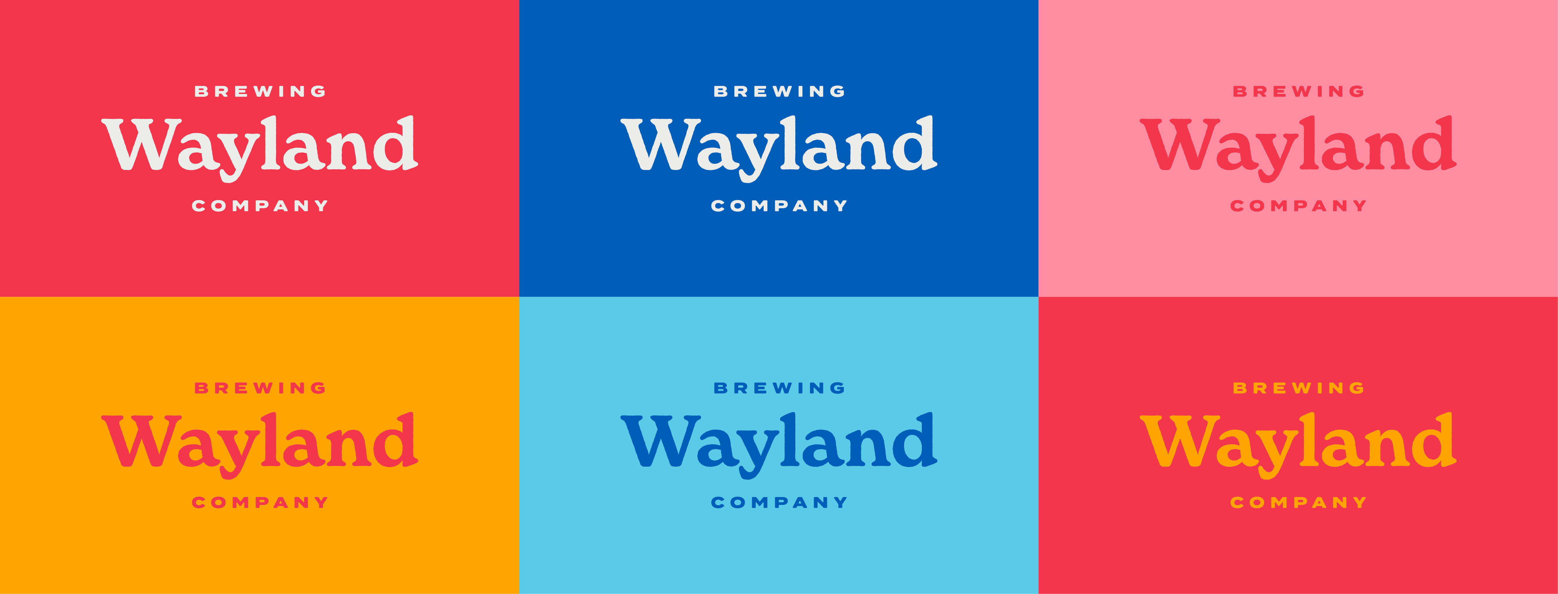
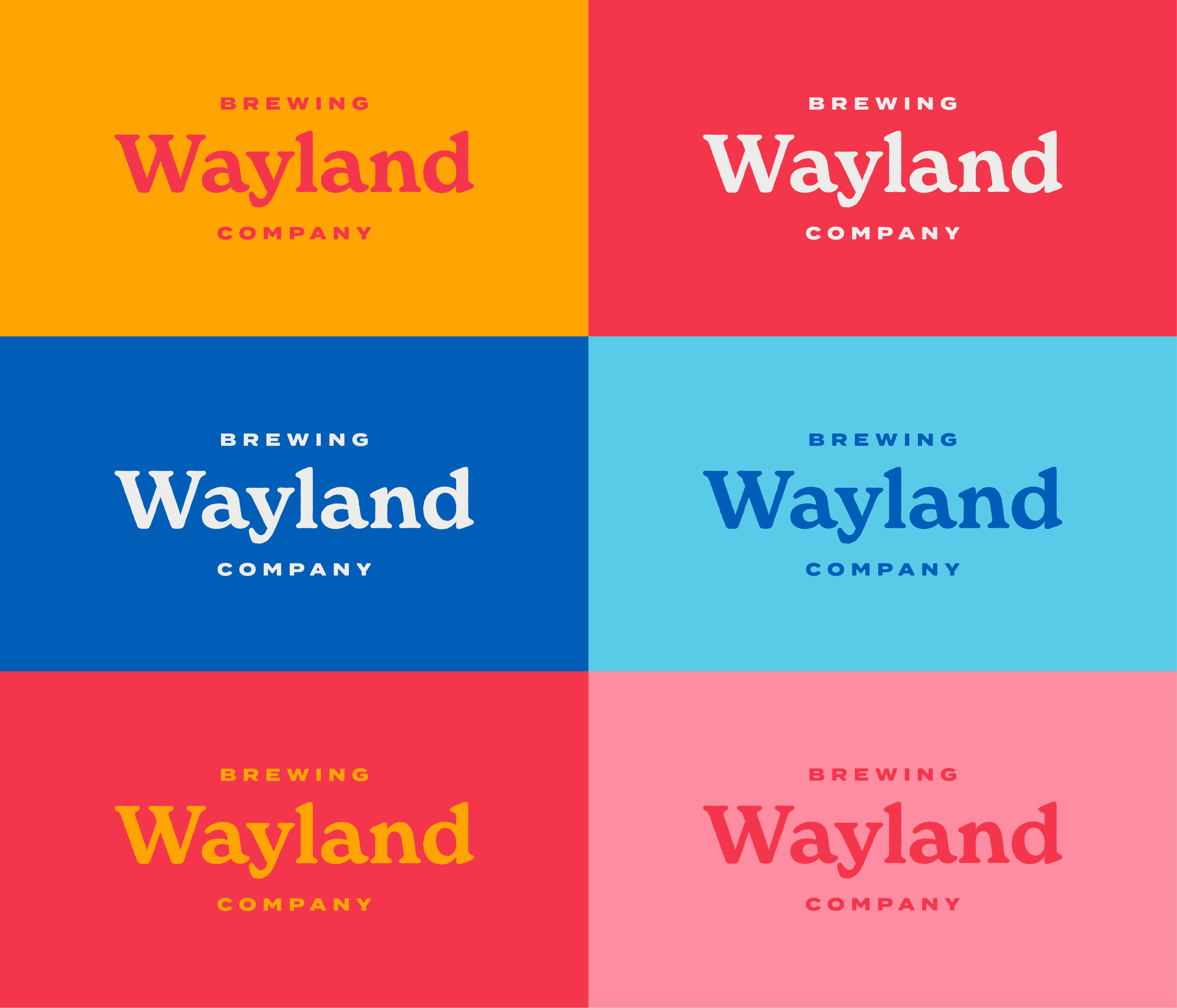
The visual identity consists of a comprehensive logo system with numerous lockups across applications. The brandmark’s geometric shapes resemble an endless road vanishing off into the horizon, eliciting the feeling of a long drive, escapism, and relaxation. The wordmark’s letterforms have a natural, nostalgic quality, rounded out by the bold, vibrant color palette that suggests gorgeous landscapes at sunset.
Identity
The name, Wayland Brewing Company, was selected for its poetic quality and the impression it left of abandoning the stressors of daily life. Once Wayland was selected, we designed a visual identity that is at once clean, modern, natural, warm, approachable, and light-hearted.
The visual identity consists of a comprehensive logo system with numerous lockups across applications. The brandmark’s geometric shapes resemble an endless road vanishing off into the horizon, eliciting the feeling of a long drive, escapism, and relaxation. The wordmark’s letterforms have a natural, nostalgic quality, rounded out by the bold, vibrant color palette that suggests gorgeous landscapes at sunset.
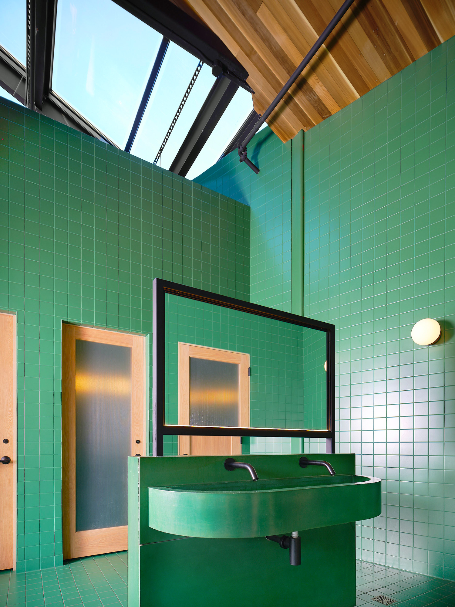
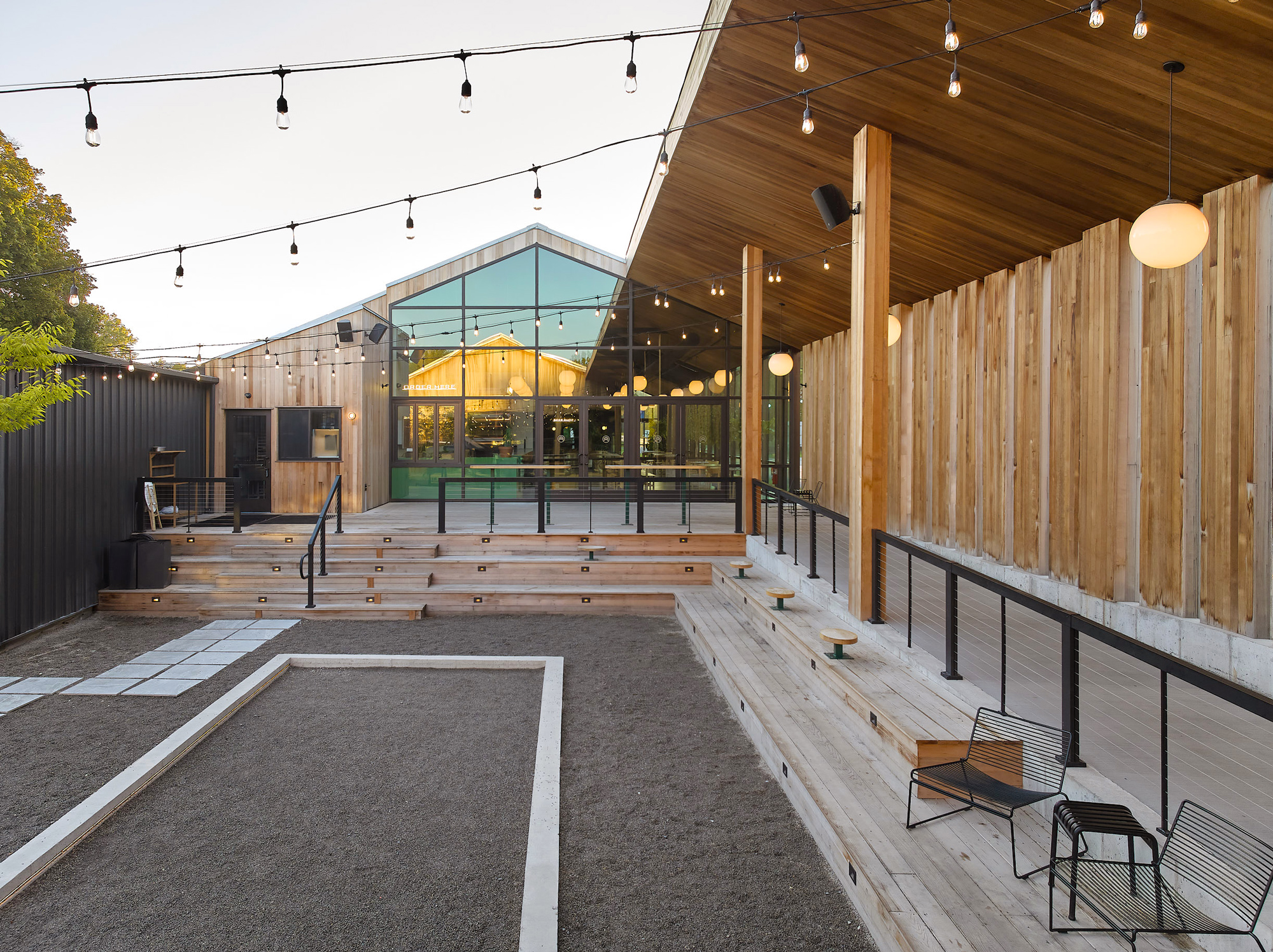
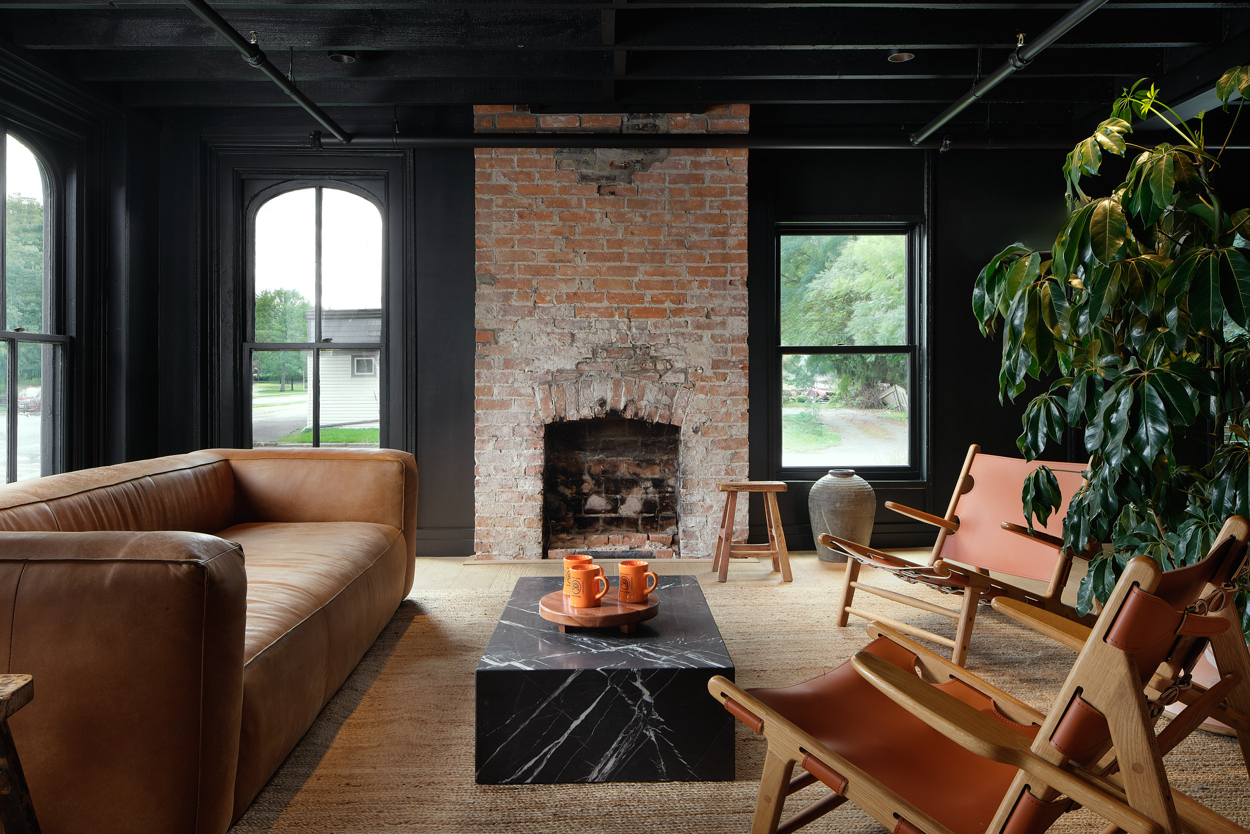
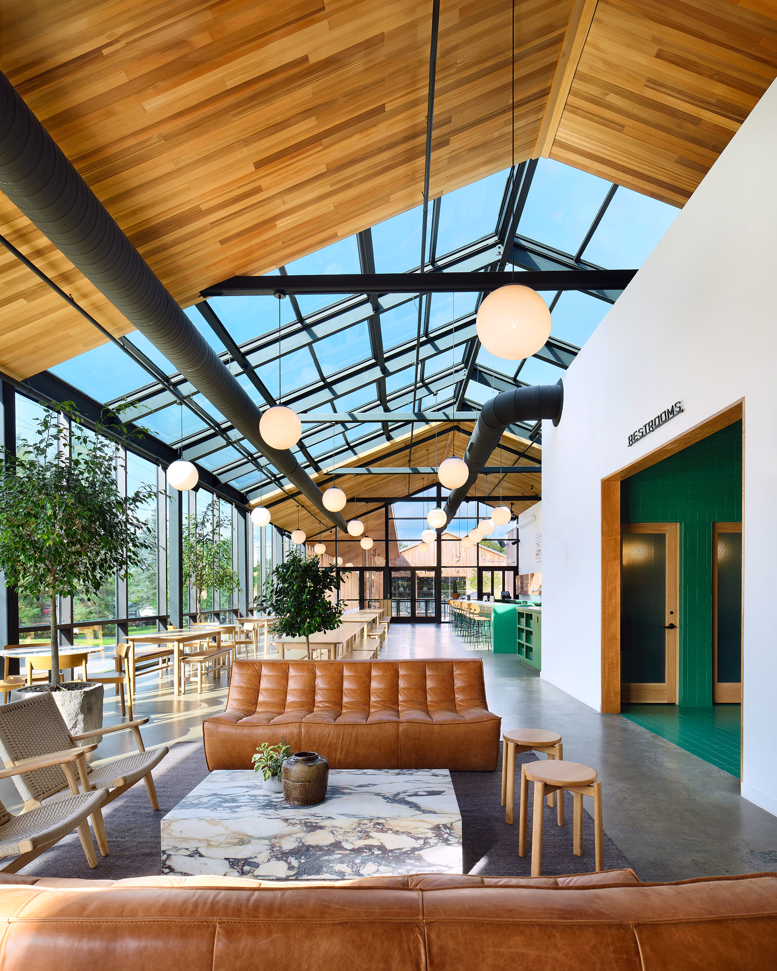
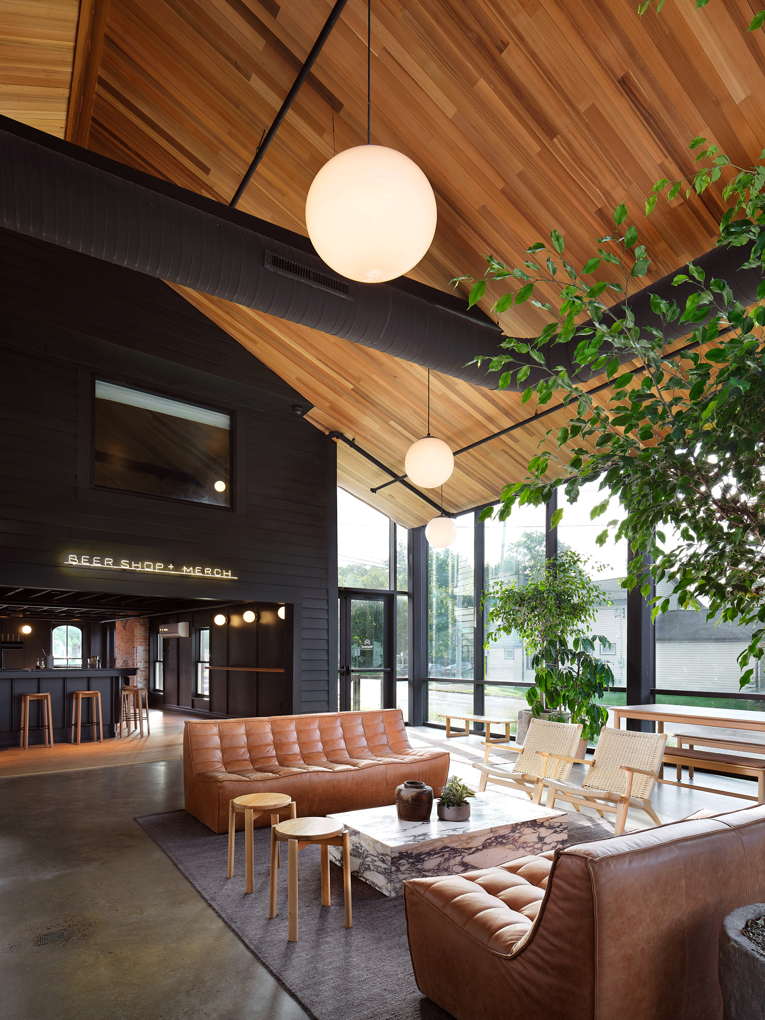
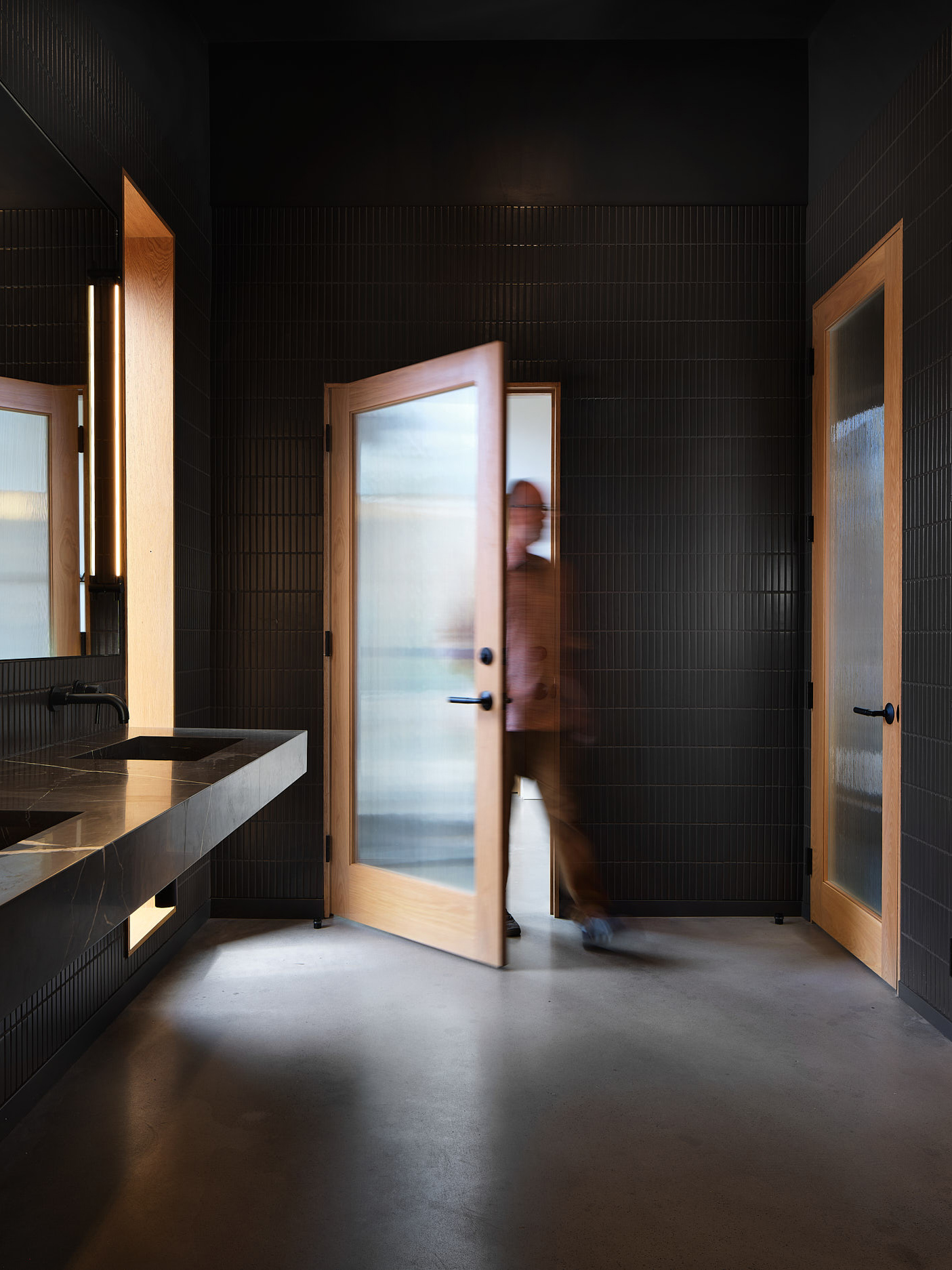
Interior & Exterior Design
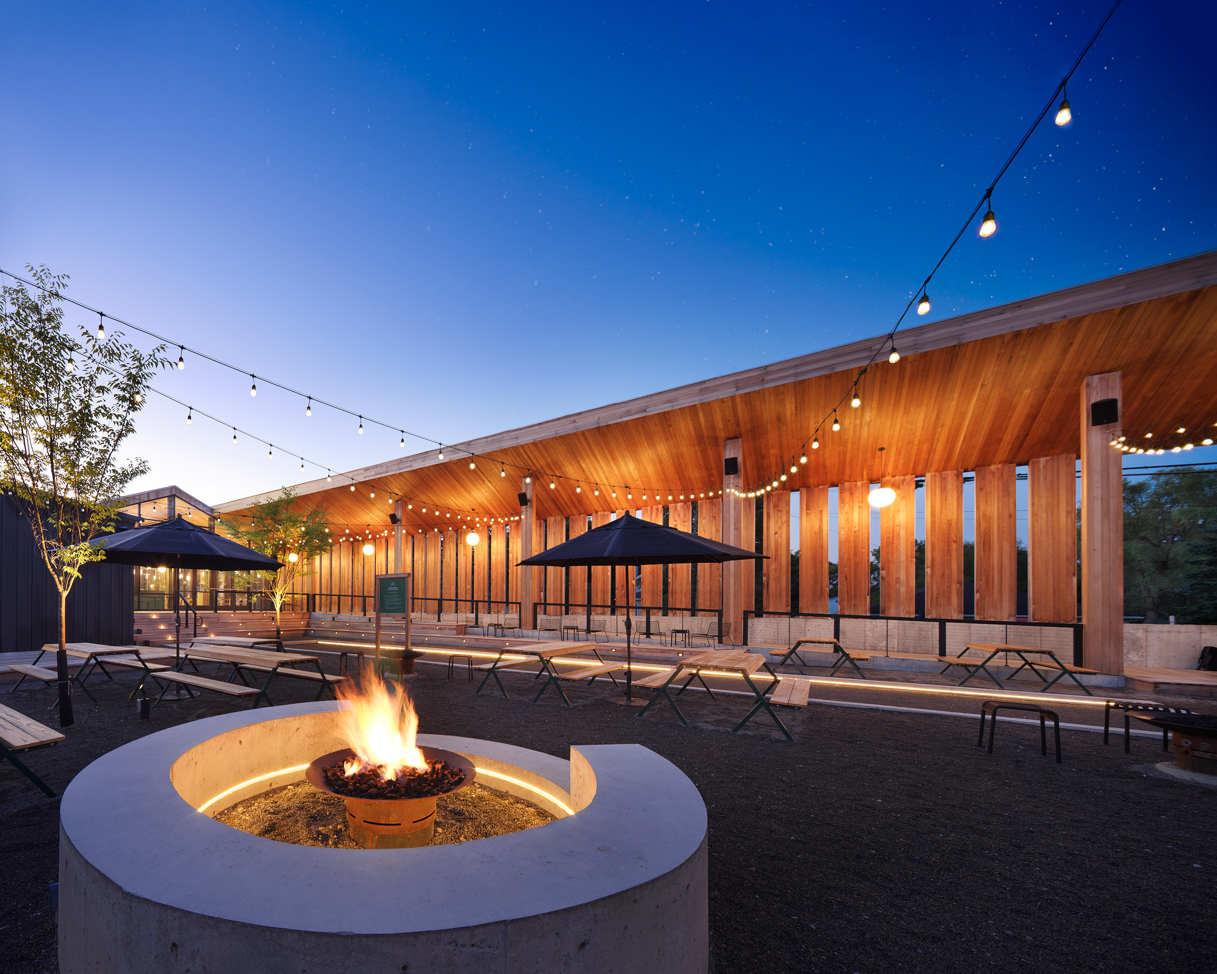
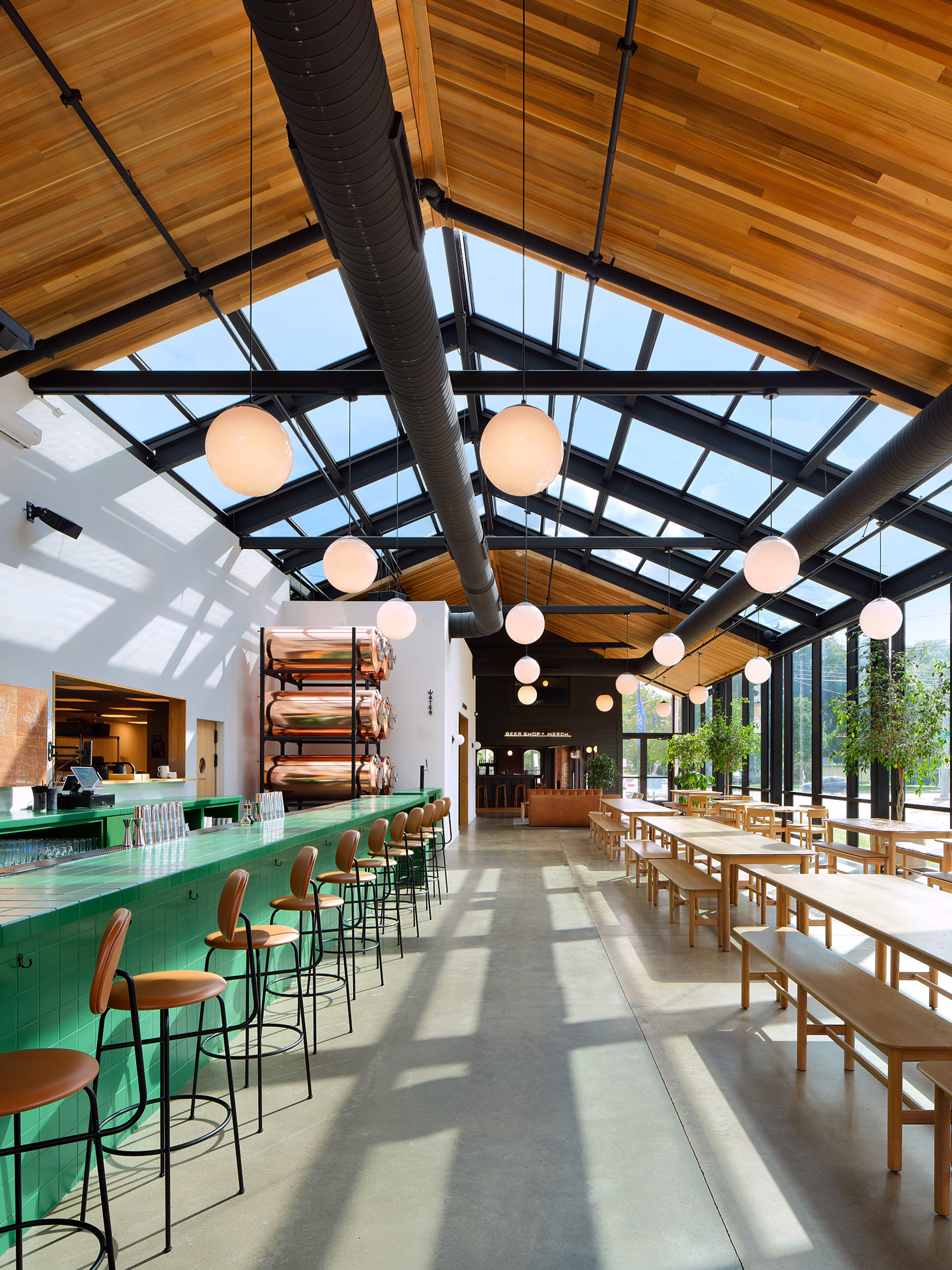
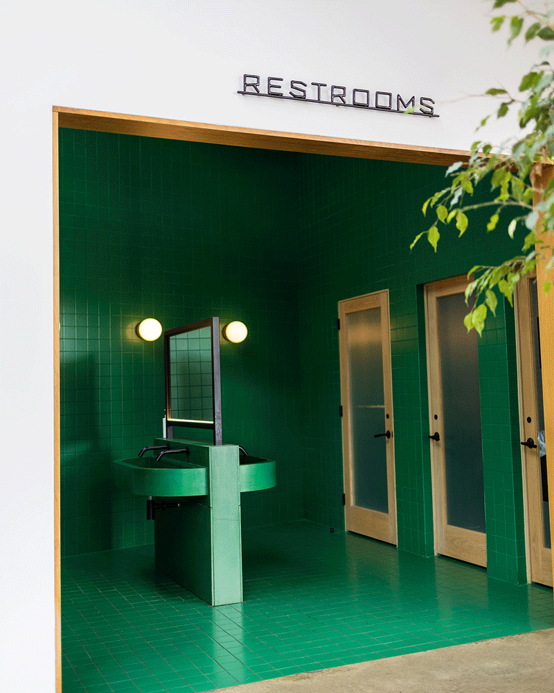
Over the course of two years, Block Club worked closely with our partners to design all aspects of the interior and exterior spaces: layouts, fixtures, finishes, furniture, and decor. Boasting tons of natural light, a raw cedar exterior, custom white oak furniture, and gorgeous stone—with pops of bright color and structured, yet playful lines that reflect our work on the brewery’s visual identity—the result evokes a blissful retreat into nature.
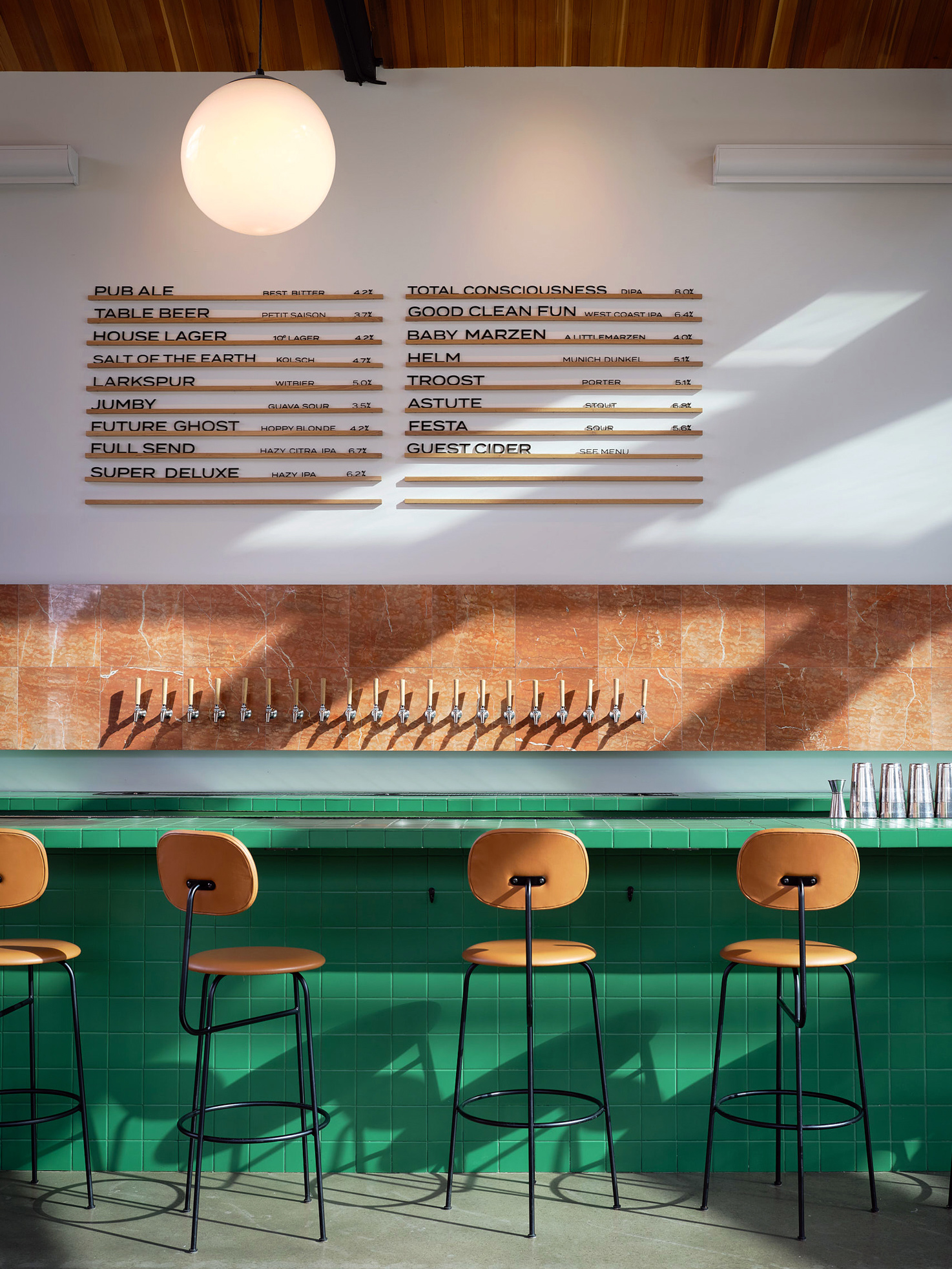

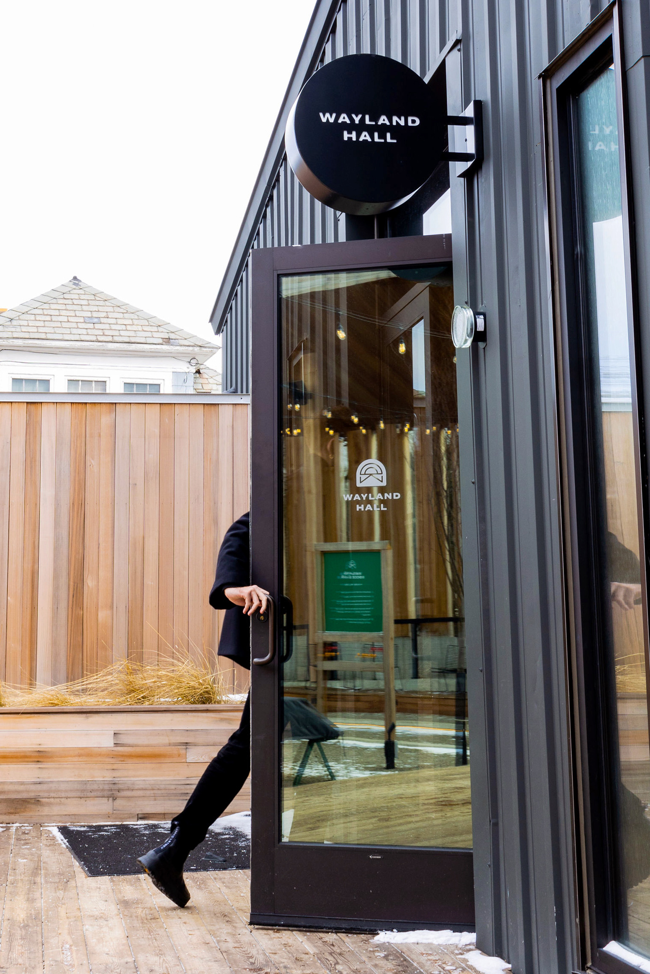
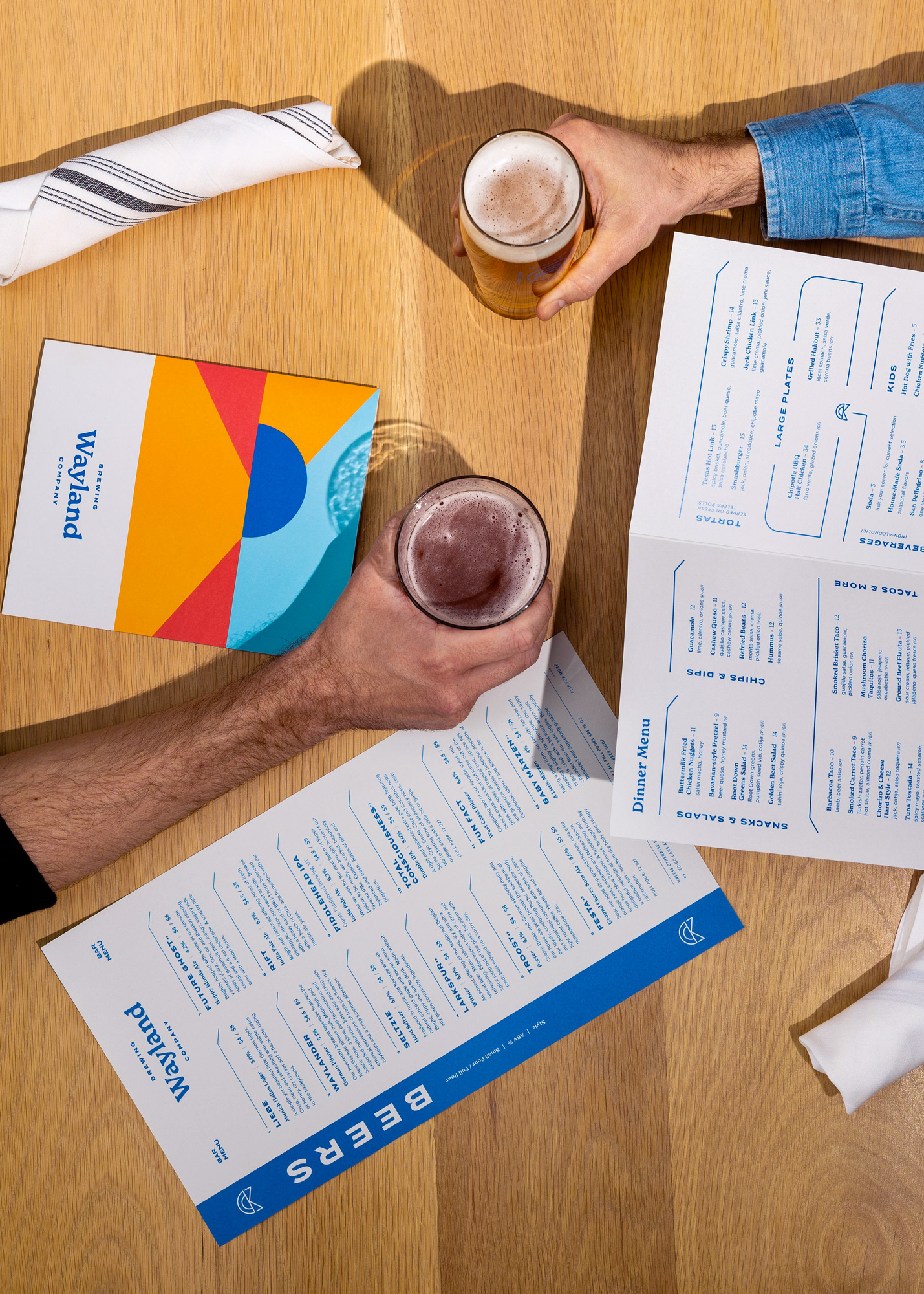
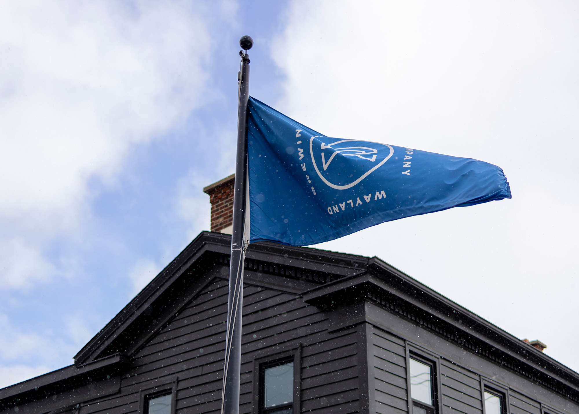
Signage, Wayfinding, Packaging & Brand Collateral
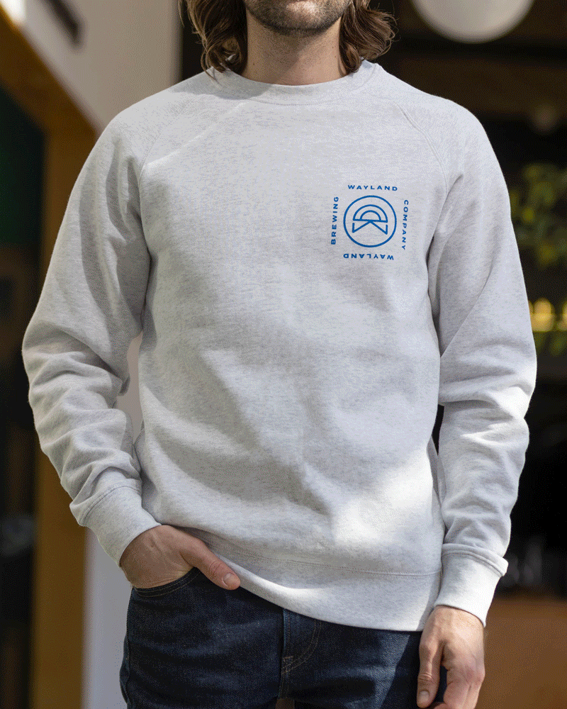
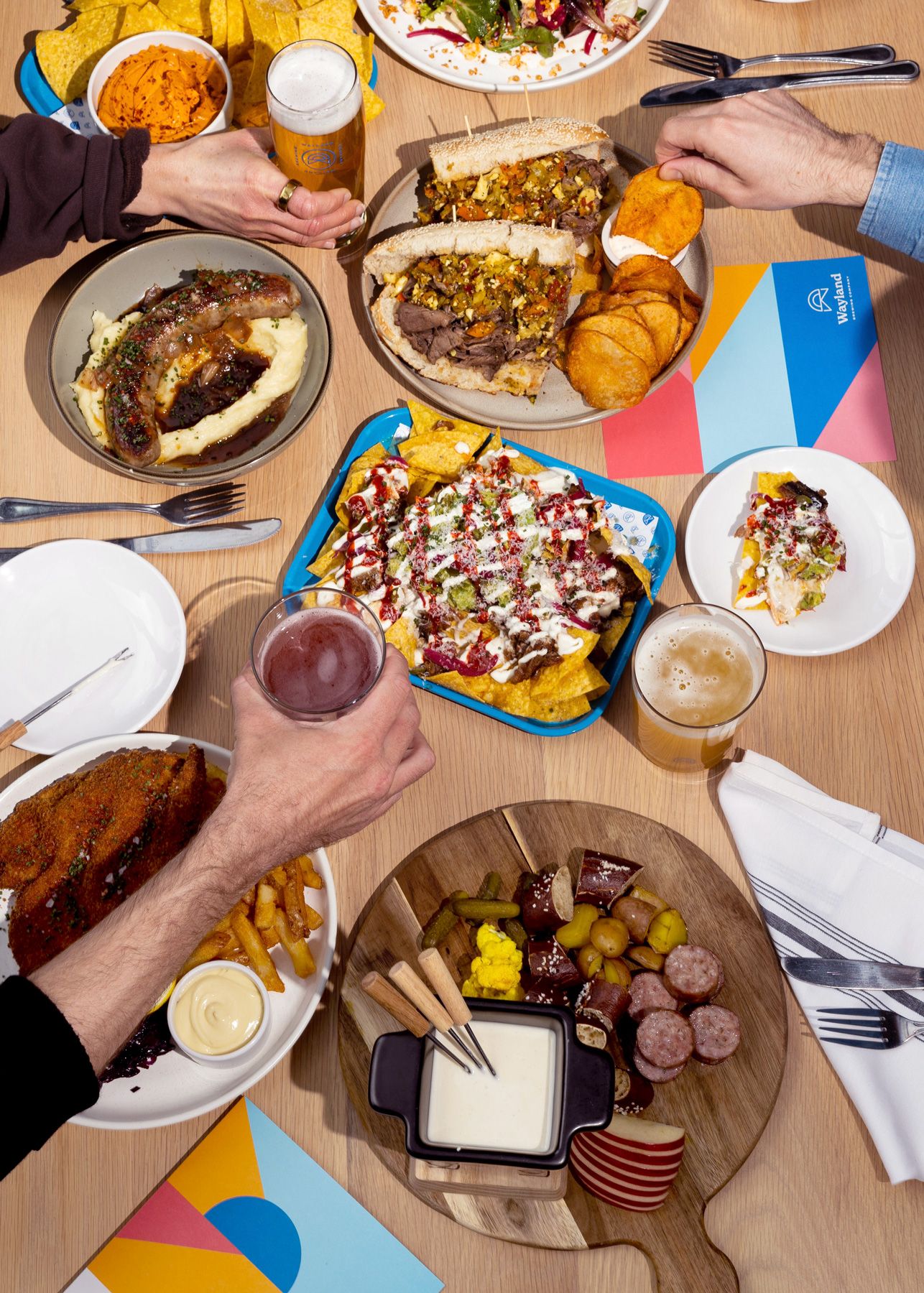
We developed a comprehensive signage and wayfinding system that features a custom typeface rendered in applications of bent steel and neon glass tubing. And we designed packaging for Wayland’s retail beers, its website, and a suite of branded merchandise—which quickly became a hit among Buffalo Bills players.


Results
Completed in 2023, our collaboration resulted in a focused brand that:
- Tells a story of tranquility, friendship, and milestone moments
- Unites every component of the brewery
- Aligns with its sister brands
- Speaks to the sensibilities of its ownership team
Above all else, Wayland has leveraged its new brand assets to create a welcoming space for its customers, so that they always have a unique and memorable experience.
Collaborators
- Collateral Printing: Keller Brothers & Miller
- Apparel Printing: Positive Approach Press
- Interior & Exterior Design Partners: Caryn Dujanovich, West End Interiors
- Signage Fabrication & Install: Flexlume
- Steel Wayfinding Fabrication & Install: Emerson James
- Neon Wayfinding Fabrication & Install: Dani Bonnet & John Davidson