Alloy
Turning a website relaunch into a market reintroduction
Alloy is one of the most established names in identity and fraud prevention. But the market still knew it for onboarding, even as the platform had grown to manage identity and fraud risk across the entire customer lifecycle, powered by agentic and machine-learning AI. So Alloy worked with Block Club to turn a website relaunch into a true market reintroduction, complete with a sharper position, a refreshed verbal and visual identity, and a use-case-driven site built to speak to four distinct buyer segments. Before launch, we pressure-tested the new messaging against competitors with a synthetic buyer panel, and it scored clearer than every one of them. Alloy went live not only with a new look, but with a stronger representation of its distinctive place in the market.

What we did
- Positioning & messaging
- Synthetic panel testing
- Brand identity & design
- Website strategy & design
%%Reframing a relaunch as a%% market reintroduction
Alloy had a perception problem. Many buyers still thought of Alloy as the tool that orchestrates onboarding, without realizing it now manages fraud and identity risk across the full customer lifecycle, with agentic AI and machine learning doing the work that used to require analysts. At the same time, Alloy’s homepage hadn't been materially refreshed in years, reinforcing the perception gap.
In partnership with Block Club, Alloy turned a website redesign project into a campaign introducing its next chapter. Together, we built a sharper position around two ideas the old site undersold—full-lifecycle risk management and Alloy's Actionable AI suite—and translated it into a refreshed verbal identity and messaging guide, so the whole organization could tell one consistent story from launch day forward.
%%A site and identity built for%% four audience segments
Alloy doesn't sell to a single audience. It sells to enterprise banks, mid-market banks and credit unions, and fintechs—each with different priorities and a different reason to care. The relaunch had to make every one of them feel spoken to without fracturing into four different brands.
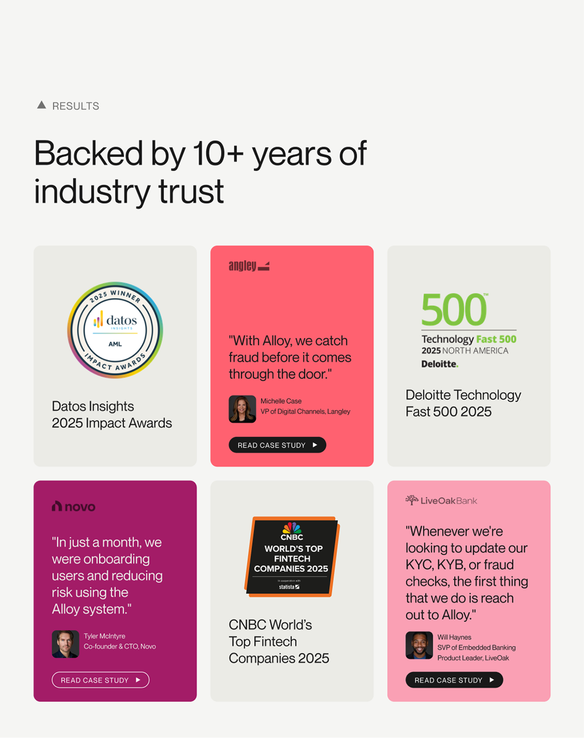
We rebuilt the site around use cases rather than features, with segment-specific pages that give each buyer a relevant entry point and proof built for their world. A refreshed visual identity—motion, a more distinctive design language, and far more prominent client storytelling and social proof—signaled the same thing the messaging did: Alloy is a company that has moved forward and can reliably bring its financial organization customers along with it.
%%Messaging tested%% against competitors before launch
Most repositioning work asks a client to trust that the new message is clearer than the old one. We proved it by testing it via a synthetic buyer panel spanning Alloy's four segments.
The panel scored the new above-the-fold messaging against competitors' on clarity. The findings sharpened the work by giving us data-backed rationale for our copy decisions. We iterated until Alloy's messaging scored clearer than every competitor we tested, allowing Alloy to launch knowing its new story would land immediately.
The bottom line
Alloy relaunched as the company it had already become: a full-lifecycle, AI-powered identity risk and fraud prevention platform. The new site reset the story for prospects across four segments, gave the internal team one clear way to talk about the company, and shipped with proof that the message was clearer than the competition's before launch.